Having completed a majority of my projects in Illustrator, I felt that I was not as proficient working in InDesign as I should be. For my independent study class, I decided to learn more functions of InDesign to become comfortable working with this application. I went about this goal by designing a fictitious magazine brand and layout. I feel this was able to improve my layout skills and my ability to understand the majority of InDesign's most used features.

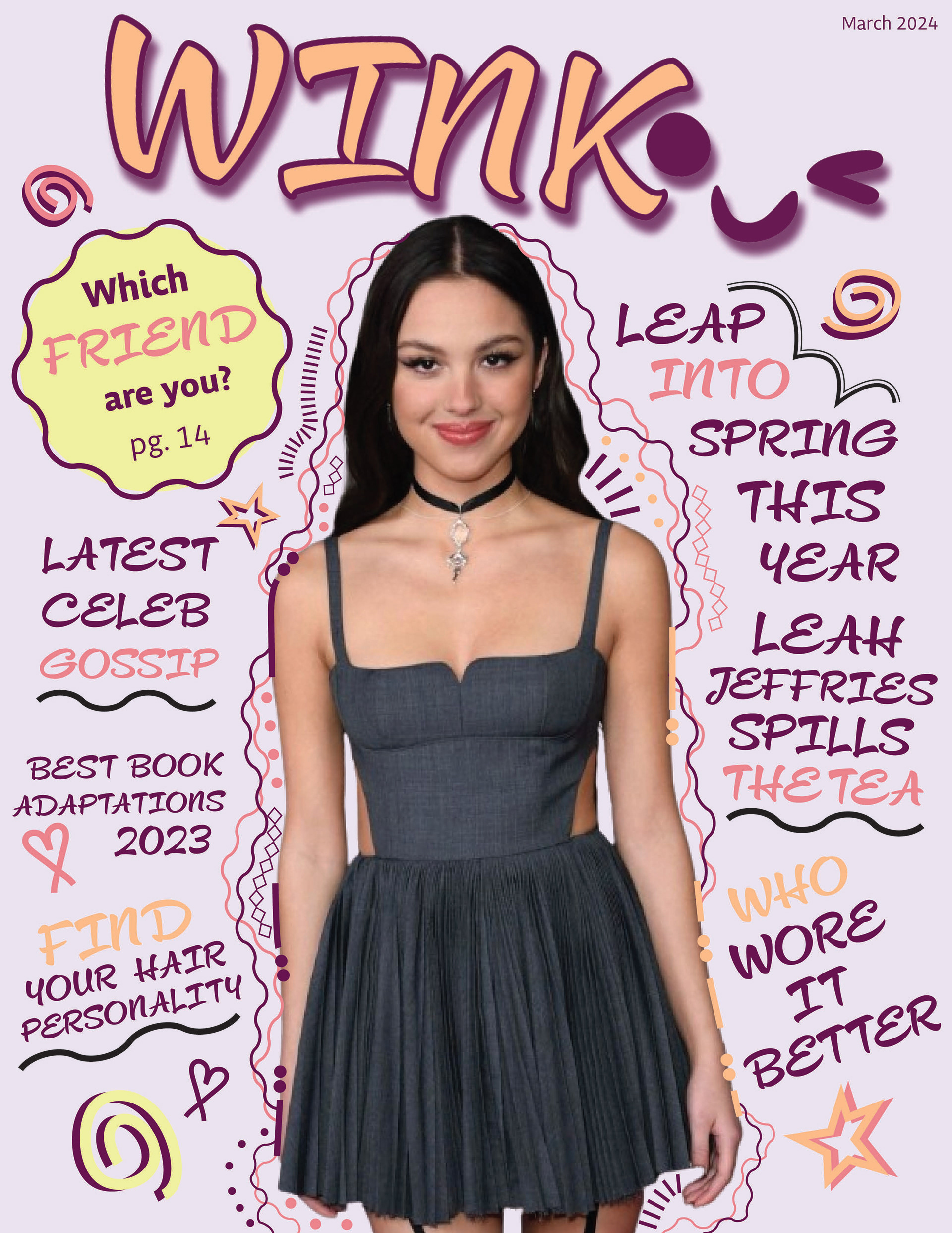
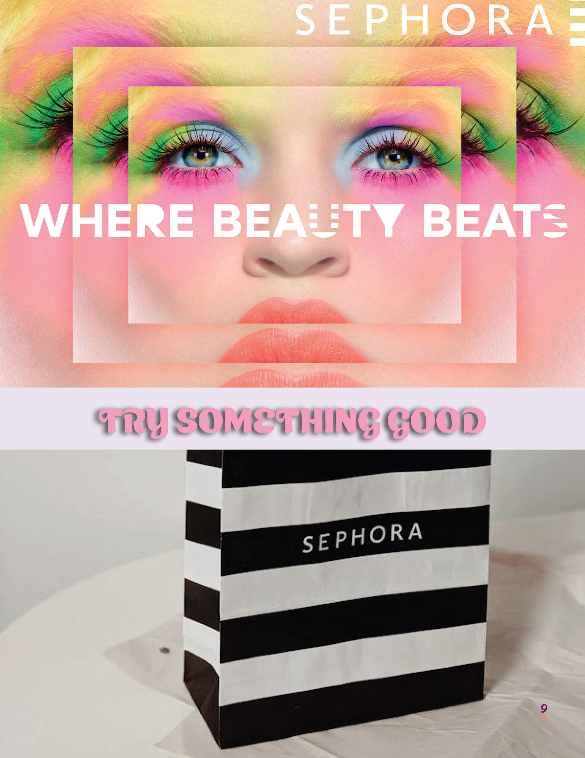
The branding I decided to go with is targeted toward younger girls aged about nine to fourteen. My inspiration for choosing this audience is because I remember as a kid seeing the teen magazines at the store or the library and wanting to read them so bad. J-14 and Seventeen are the top magazine brands I remember being very intrigued by. The celebrity focus on the cover with the fun challenges and polls throughout the article definitely drew me in. I wanted to create something similar but with my own twist to it. I started off with a colour scheme, four main colours that would be the face of the issue. I then created the simple winking logo based on the name. I did ask around for peoples opinion on what name would fit. Some of the secondary choices were "Tea'n"(like teen but a play on how kids nowadays like to spill the tea), "Hush" and "Glam".
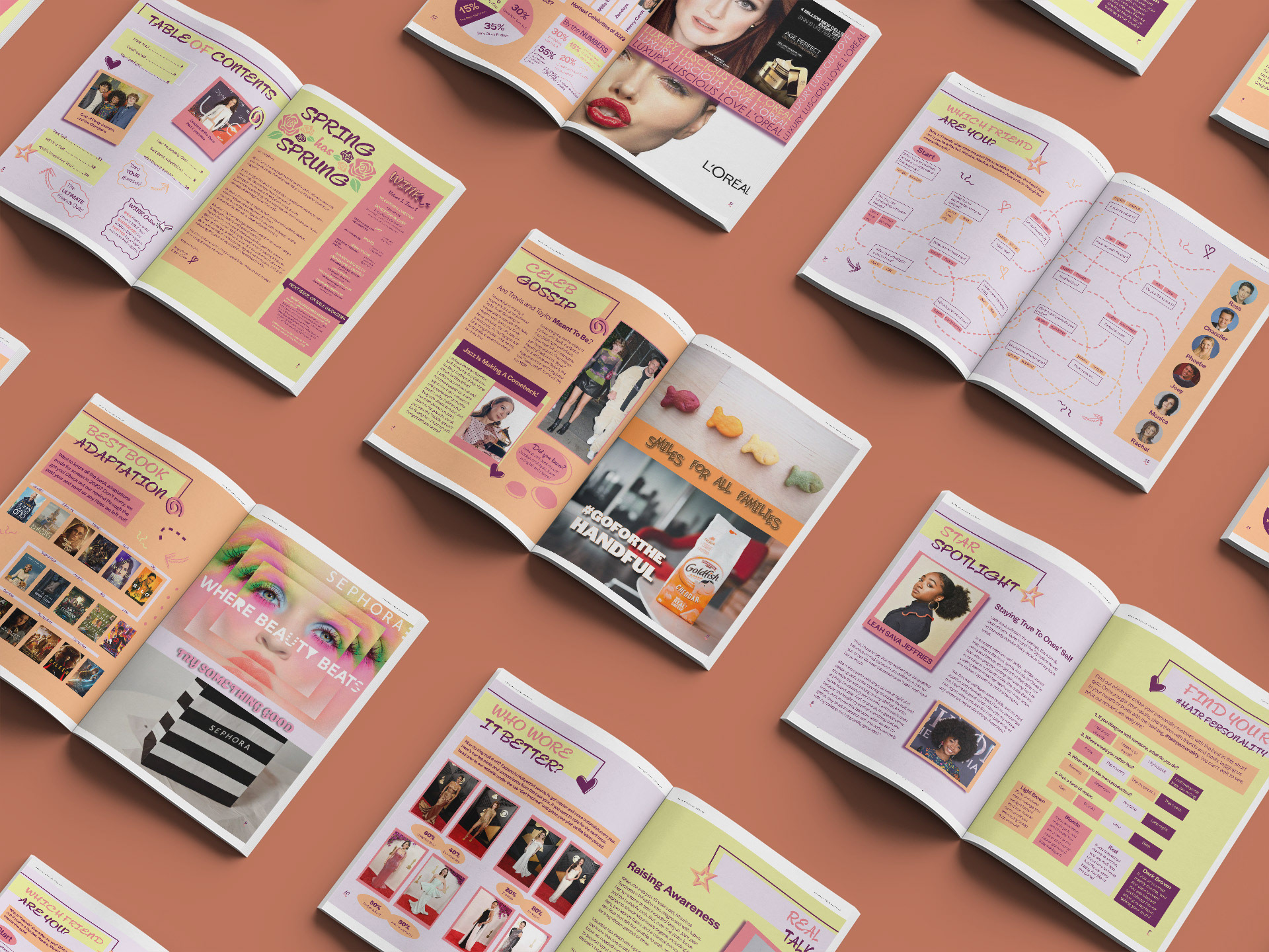
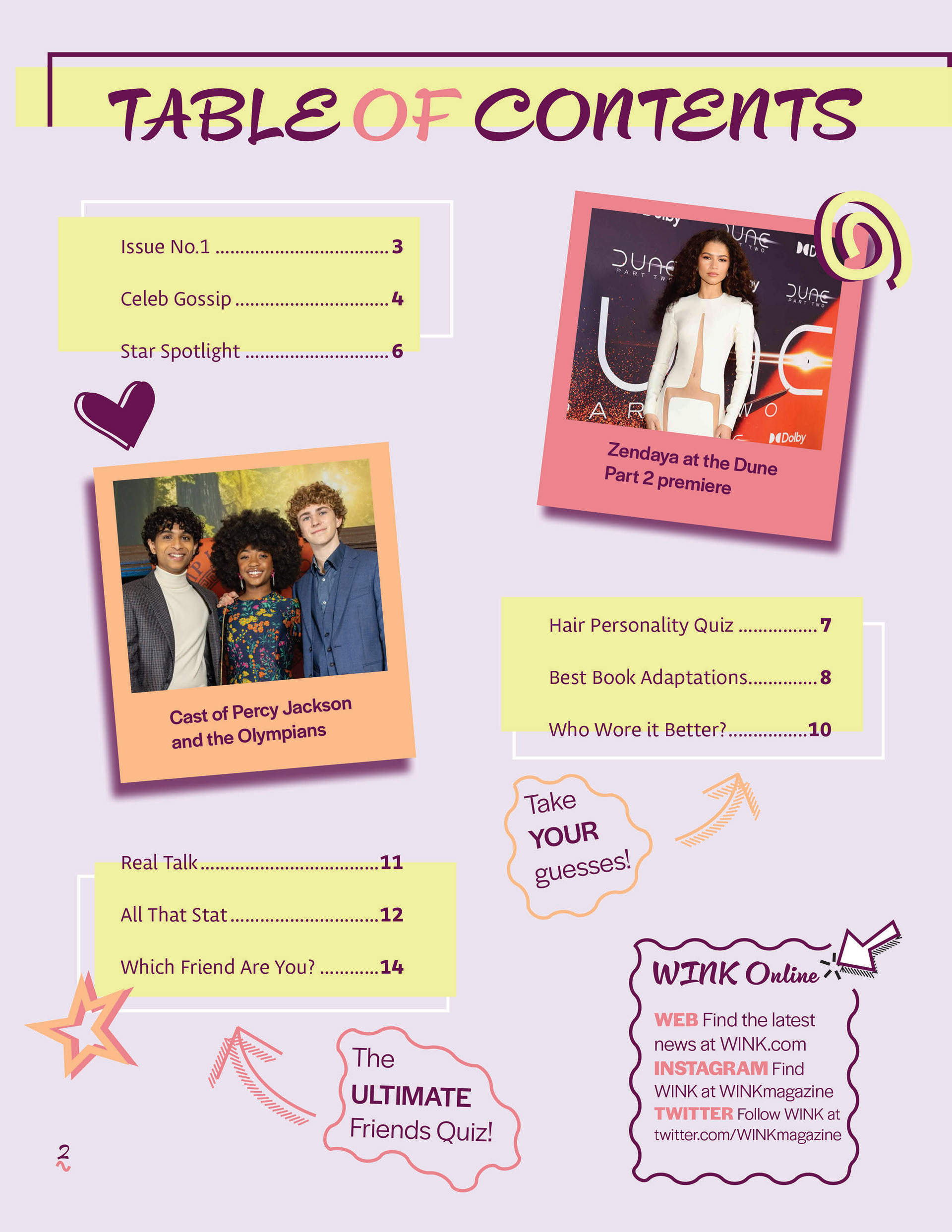
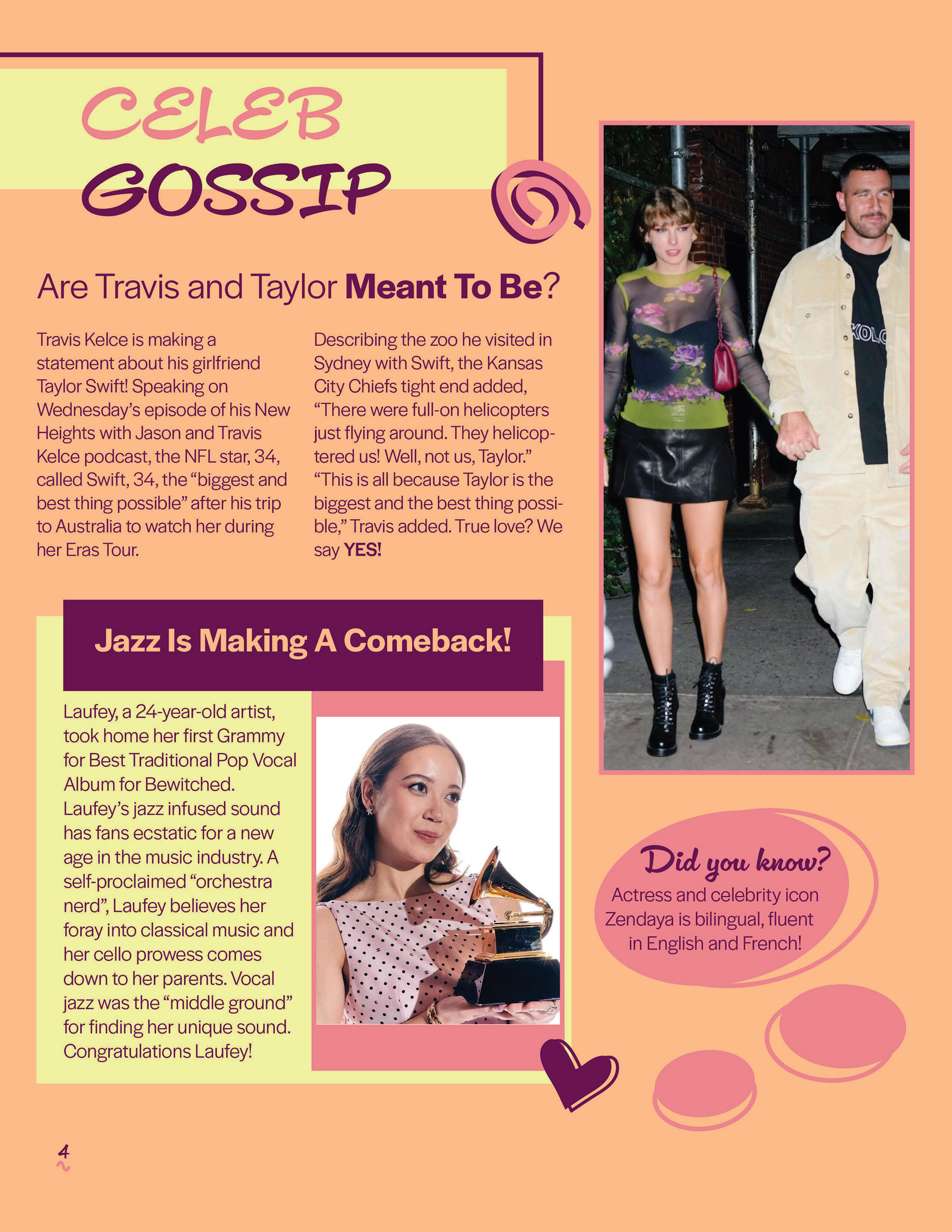
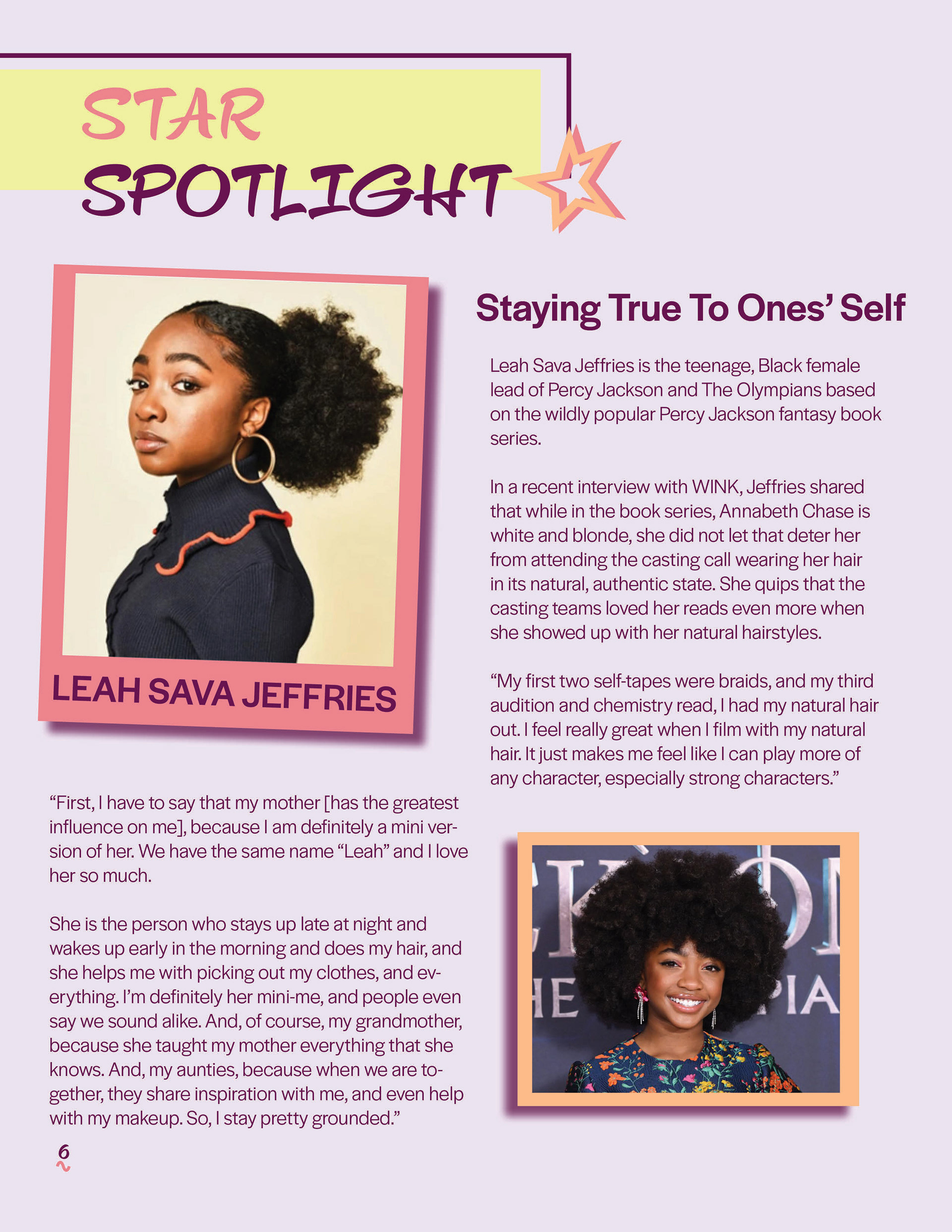
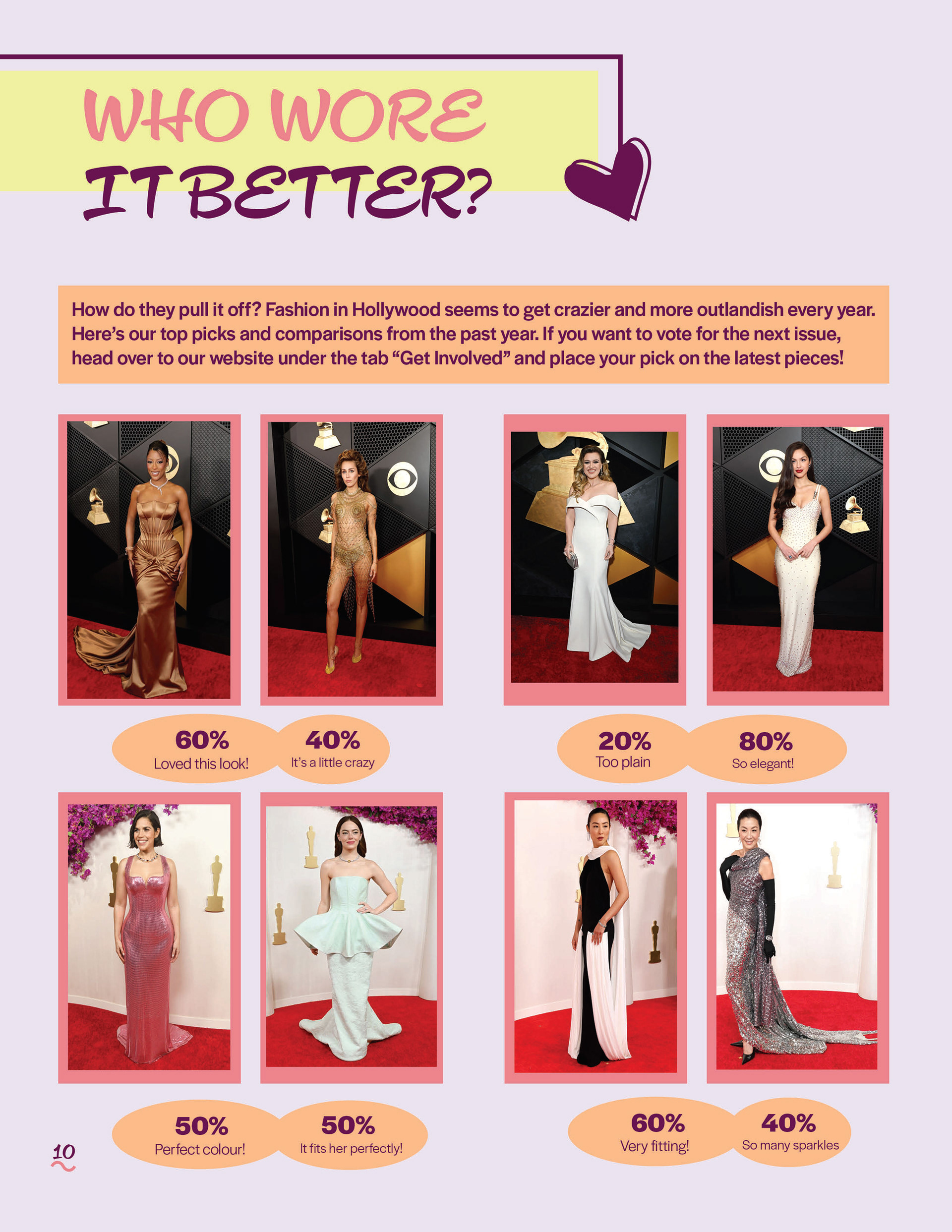
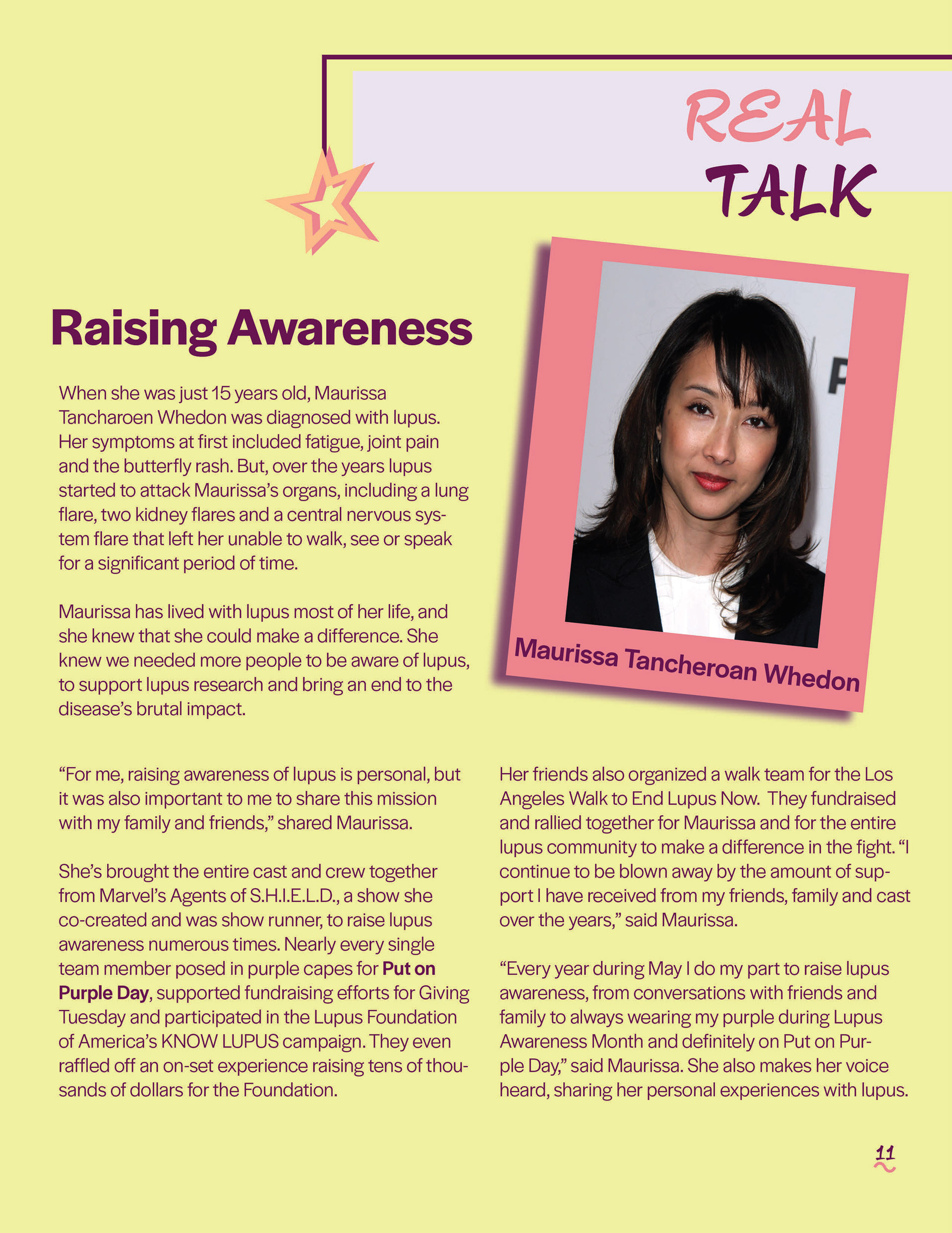
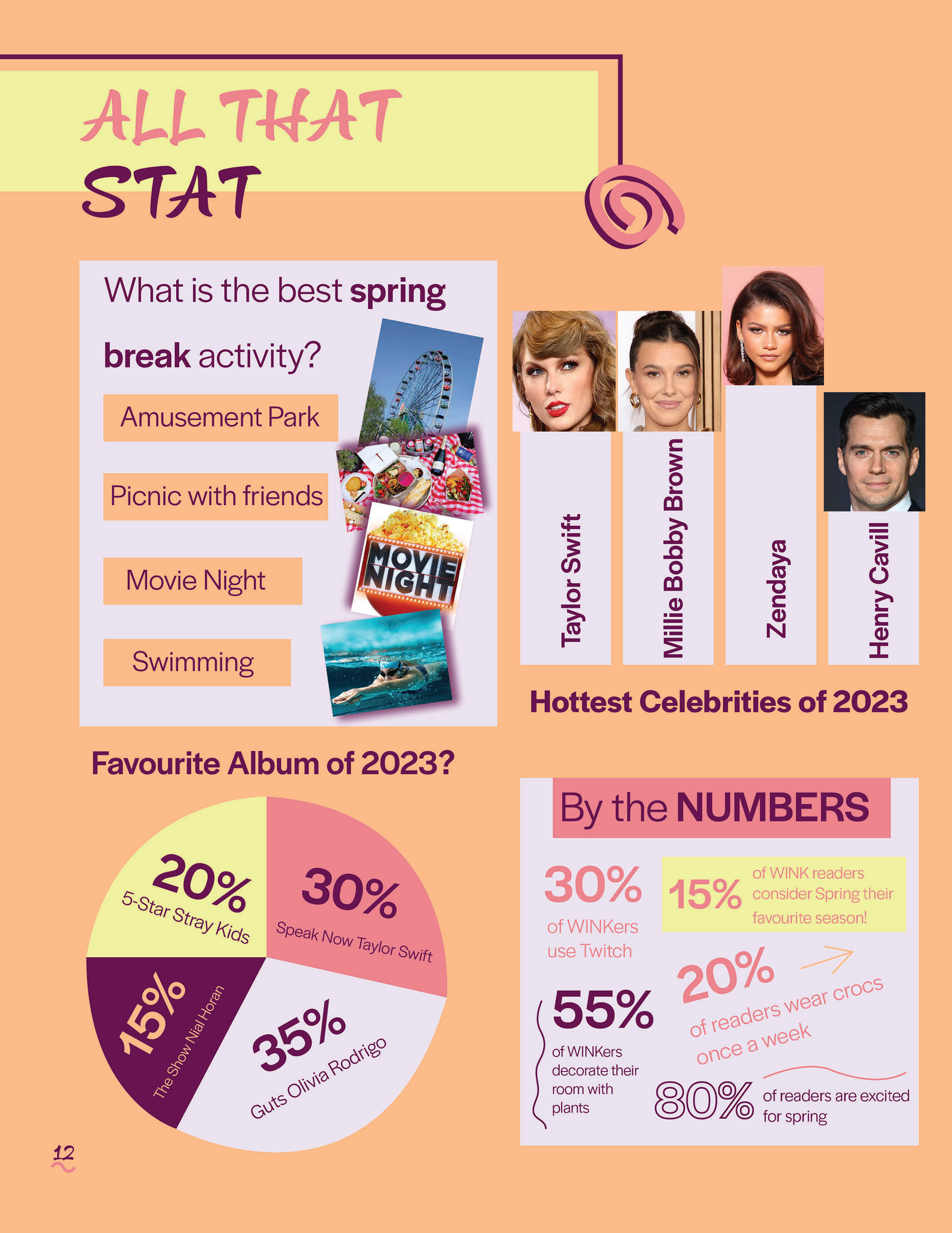
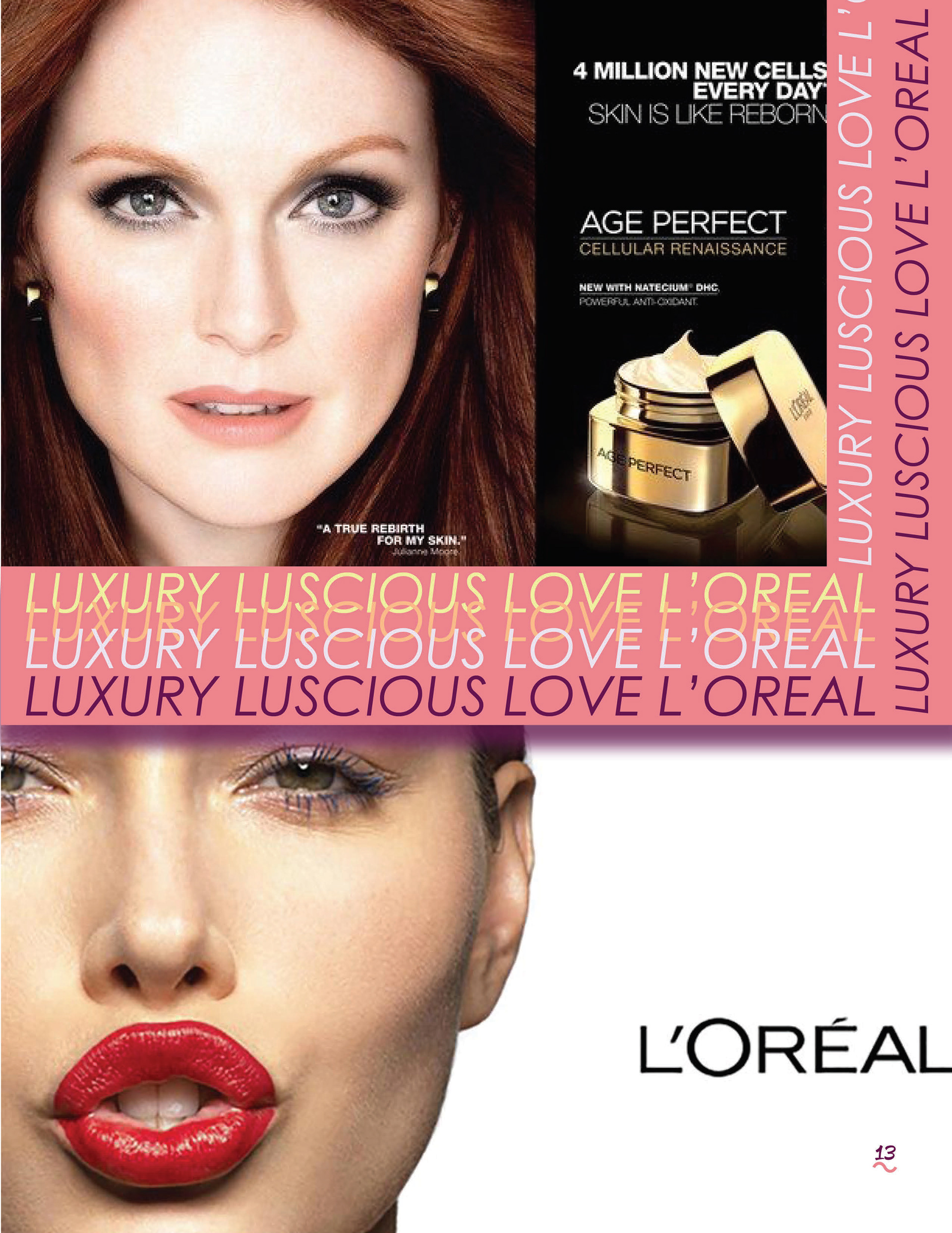
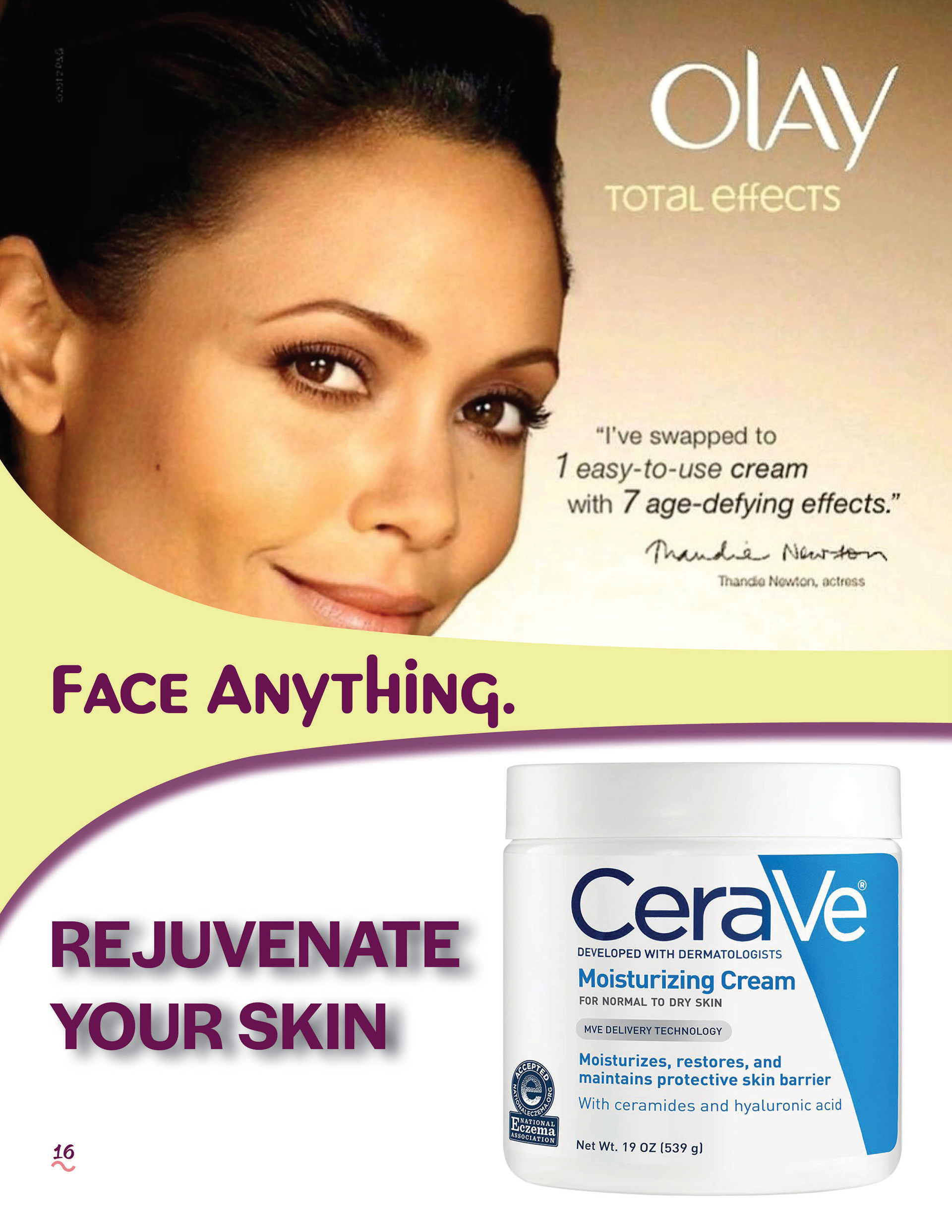
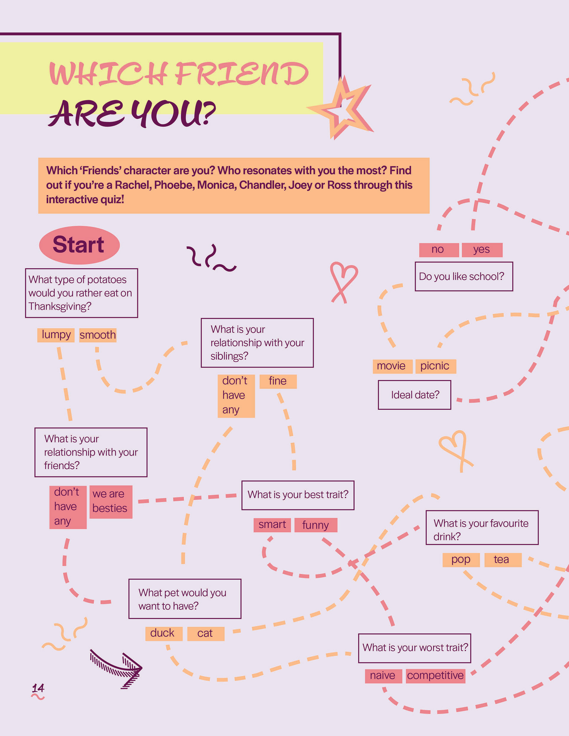
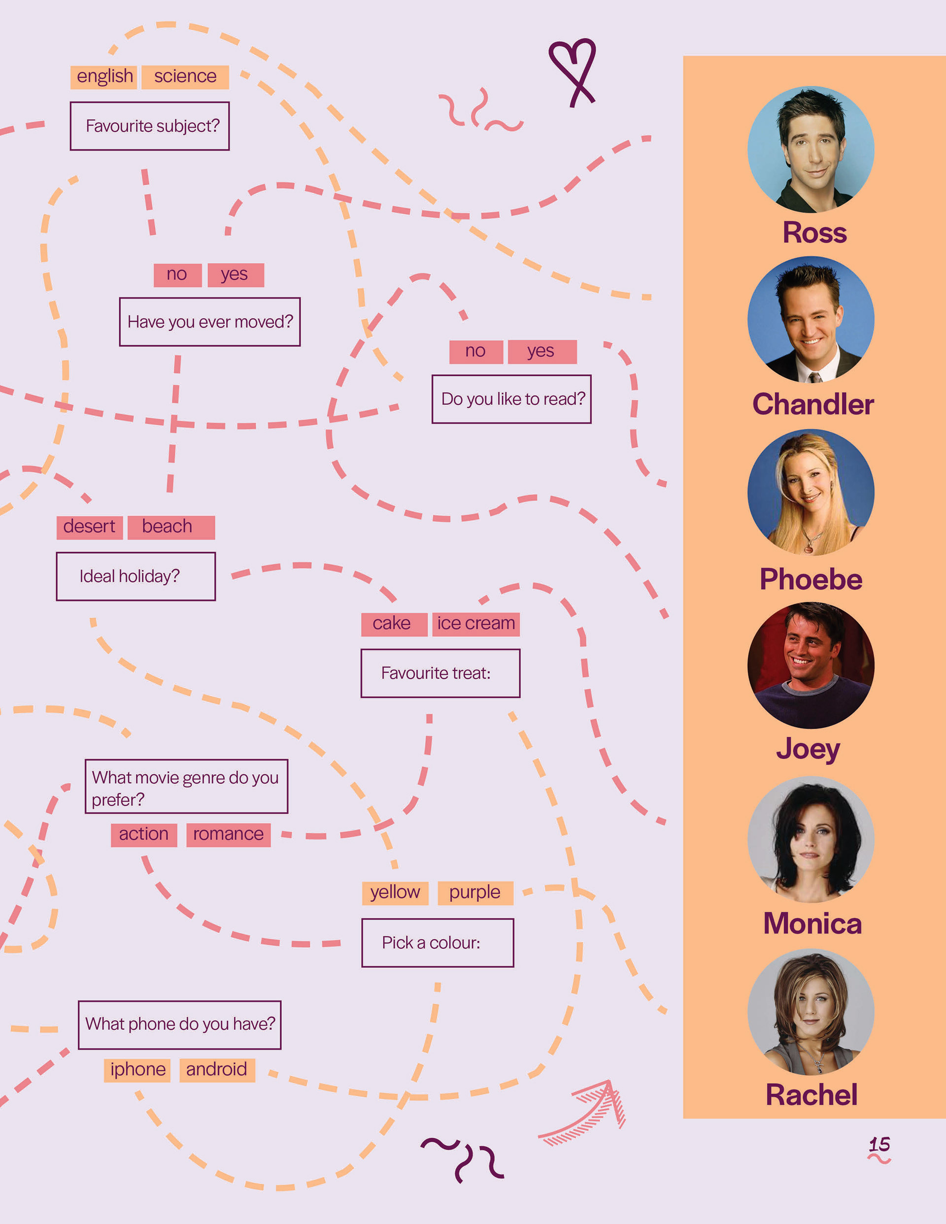
The sixteen page issue touches on topics that might be of interest to young girls at this stage of their life. Recent celebrity gossip, any fun statistics, for book lovers some top adaptations from the past year, some interviews with rising stars and ultimately some quizzes to complete. I wanted the magazine to embrace the girly aesthetic and if it ever got printed, to draw peoples attention. I enjoyed creating the assets for the magazine like the editorial page flowers and the fake ads. It was fun to have a lot of creative freedom working on this piece!