With this project, I decided to continue and finish a series I had started last year in 2023, during my summer off. I was attempting to re-design Taylor’s albums based on design principles. I thought this was a cool idea to help me with my design skills and to learn how to apply these basic principles to anything. I divided five of the covers under the idea of harmony within design. The principles that correlate to this are scale, balance and unity. I then divided the remaining five under the idea of cohesive composition within design. The principles that correlate to this are pattern, contrast and rhythm.
HARMONY
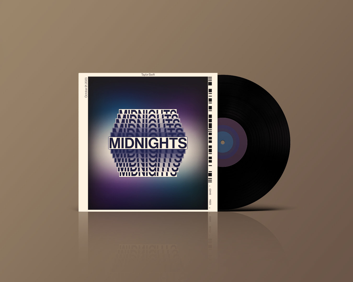
Harmony in design is important, it can make or break the final result. It ensures that the elements work together to create an appealing and pleasing look as a whole. The albums that I chose for this project were Red, Reputation, 1989, Midnights and Taylor Swift. Each cover was loosely based on the original, I kept similar colours and fonts for each album cover to give the viewer still some sense of familiarity.
Balance
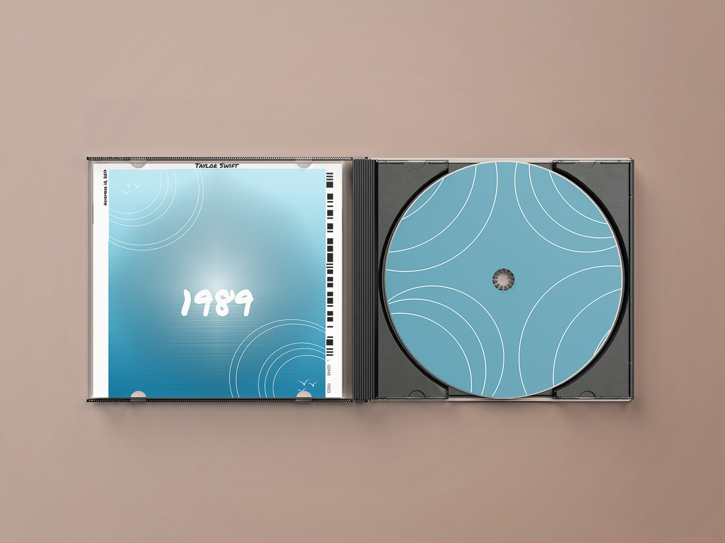
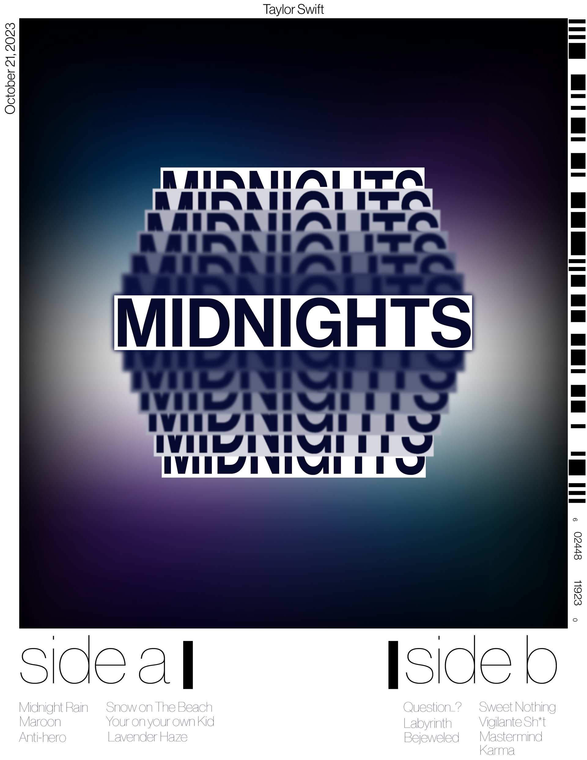
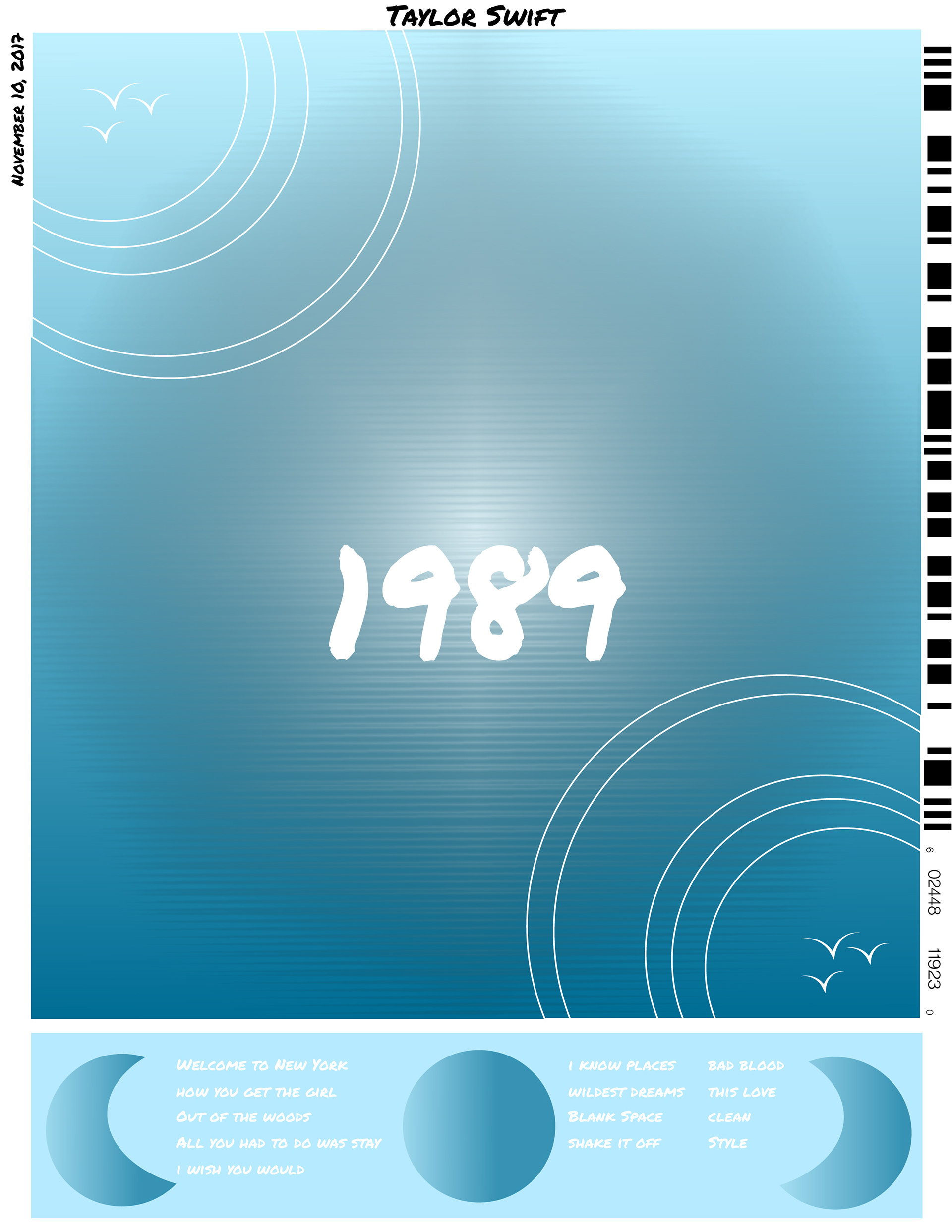
Midnights and 1989 were both used for the principle of balance and I love how they turned out. I wanted Midnights especially to feel like you were opening your eyes after a good sleep. Everything is blurry and you are still half asleep, not wanting to wake up to the real world. For this one, I wanted everything to be balanced space-wise. There is equal space between all the elements. 1989 on the other hand, I wanted to make it look like ripples of water on each corner of the cover. On the original cover, there are only five birds, so for the sake of my design I added another to balance it out.

Scale
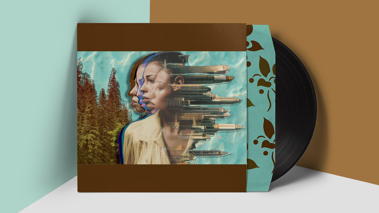
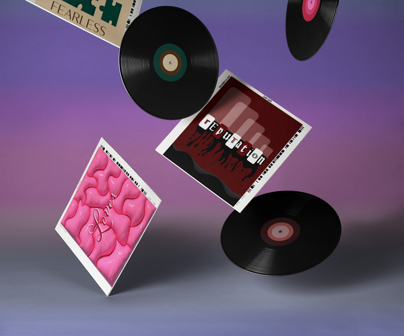
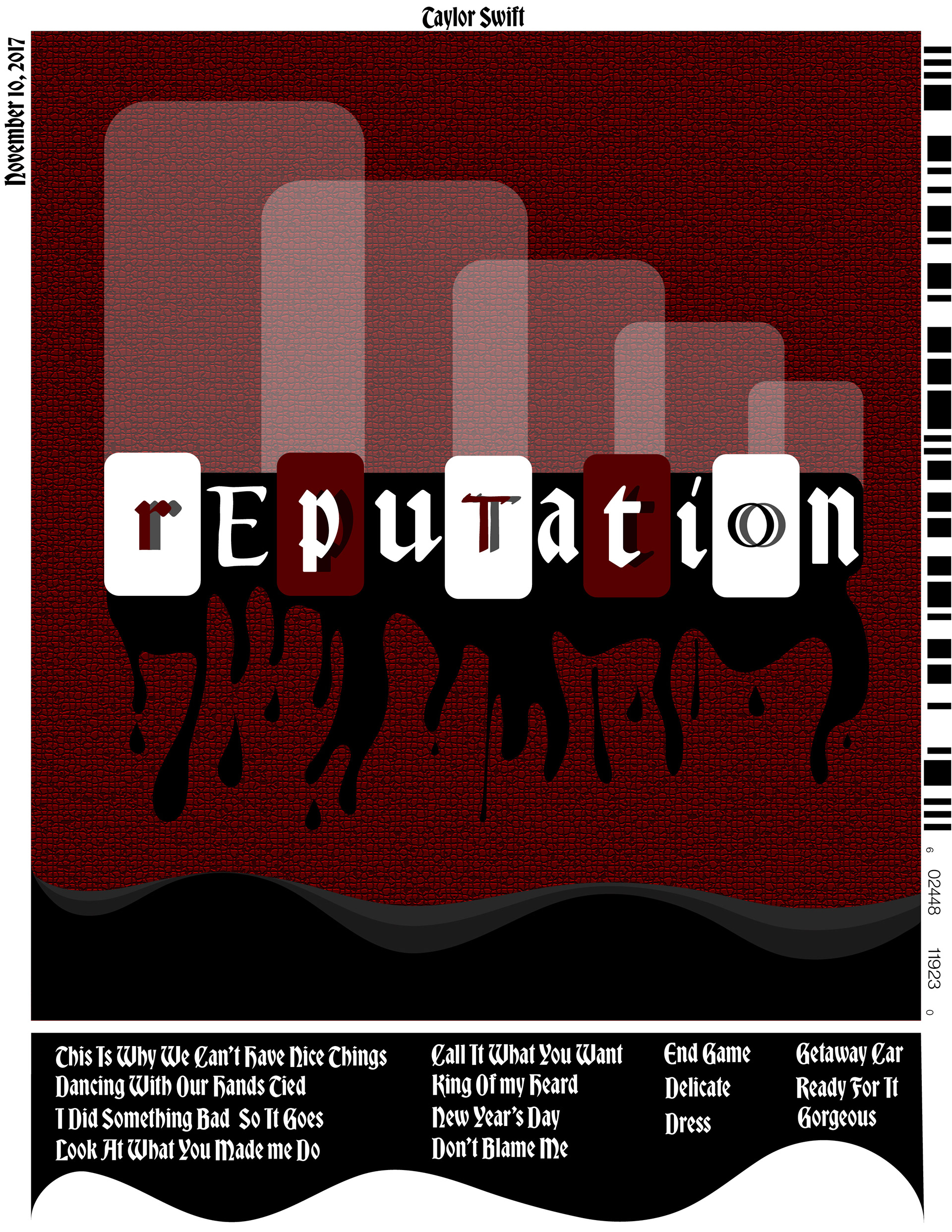
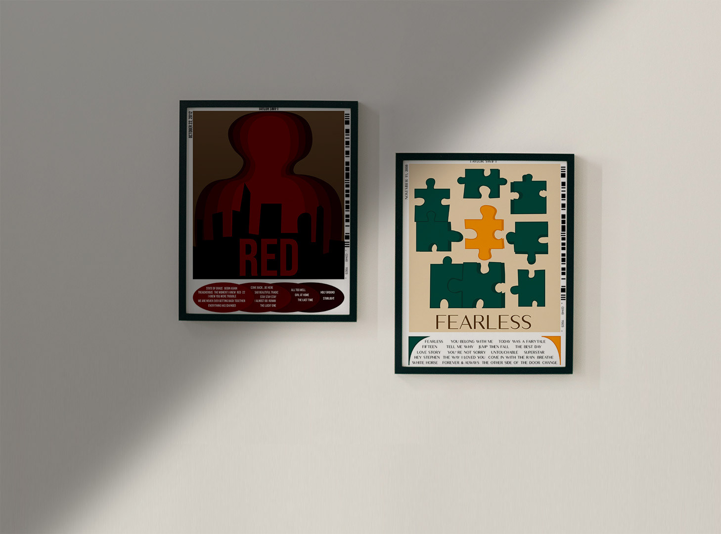
Red and Reputation focused on scale. I had a blast creating the cover for Reputation, I went full out on that one. That album is more gritty, so I wanted to play into that. I tweaked the lettering, to create an interesting composition of larger and smaller letters, while using different fonts too. I wanted it to feel like you were going downhill, spiralling in a way. The black blood dripping off the letters and filling up the bottom represents the more sinister side of Taylor. For Red, I got inspiration from this older movie poster which had the main character in the center with his shadows growing larger, all in different colours. I thought that was an interesting way to draw your eye to the poster. I scaled out each outline and then changed the colours slightly.
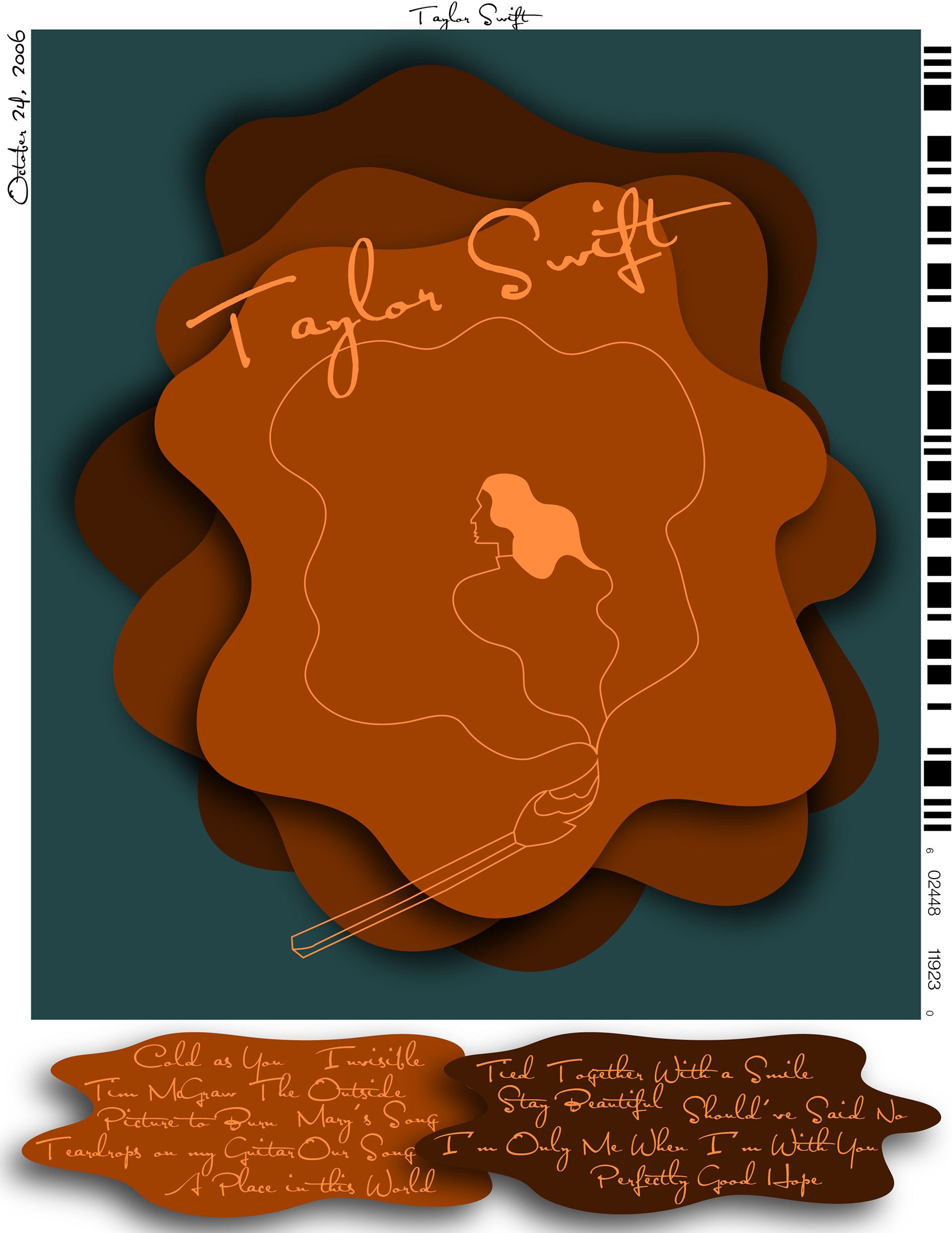
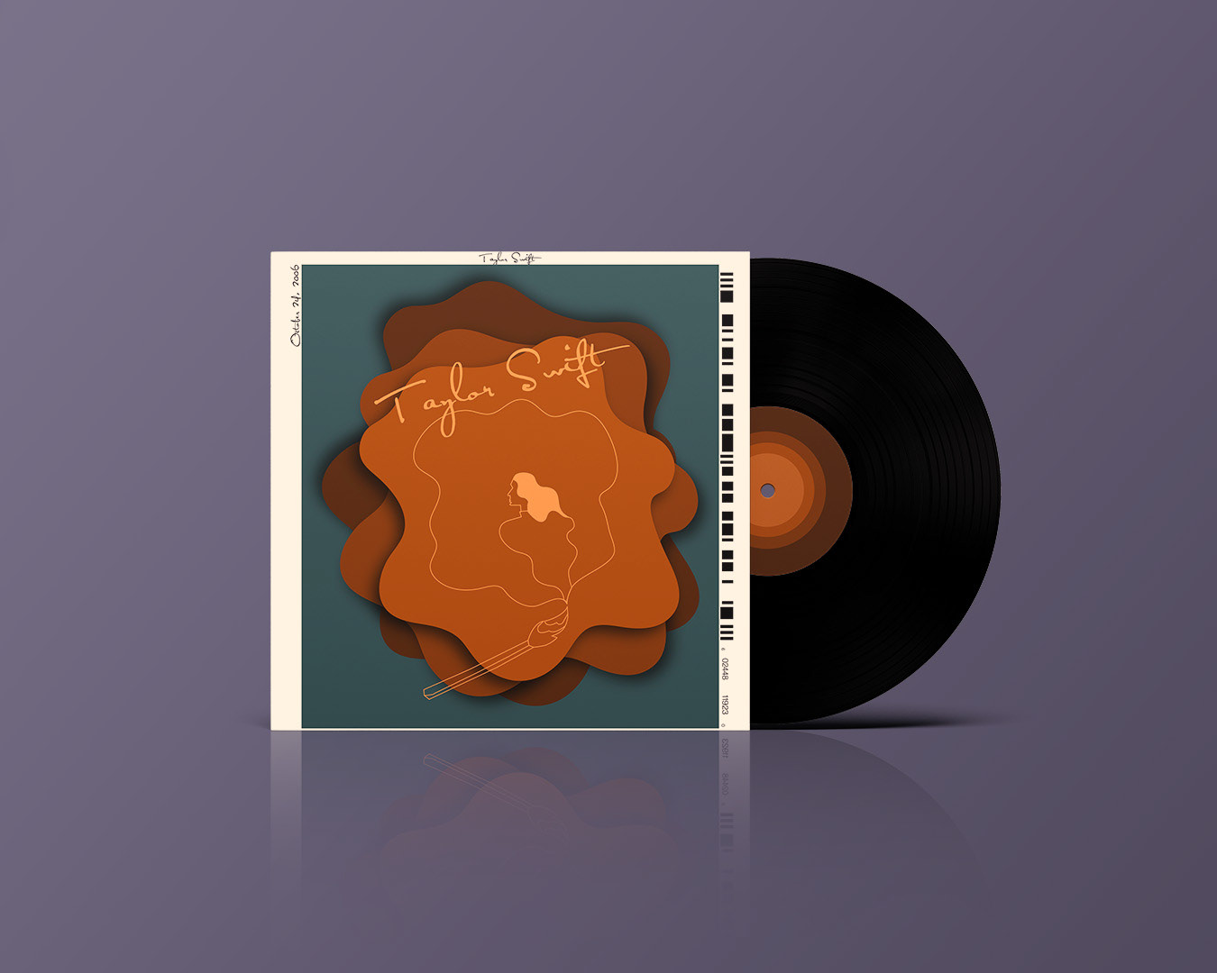
Unity
I think this one is one of my top picks from this series. I love the overall design and how it just feels right. For Taylor Swift, I wanted the cover to be simple but have an intricate feel at the same time. Somehow I pulled it off, and the final product reflects that. I think using a line art style combined with the paper cut blobs, gives it a more interesting layout which makes you want to look at it more.
Cohesive Composition
Art and design both need to utilize their composition, otherwise, no one would be drawn to it. Keeping people's attention with an interesting cohesive piece helps guide the viewers' experience. The albums I chose for this project were Speak Now, Evermore, Fearless, Lover and Folklore. Again, each album is based on the original, with colours and fonts roughly staying the same.
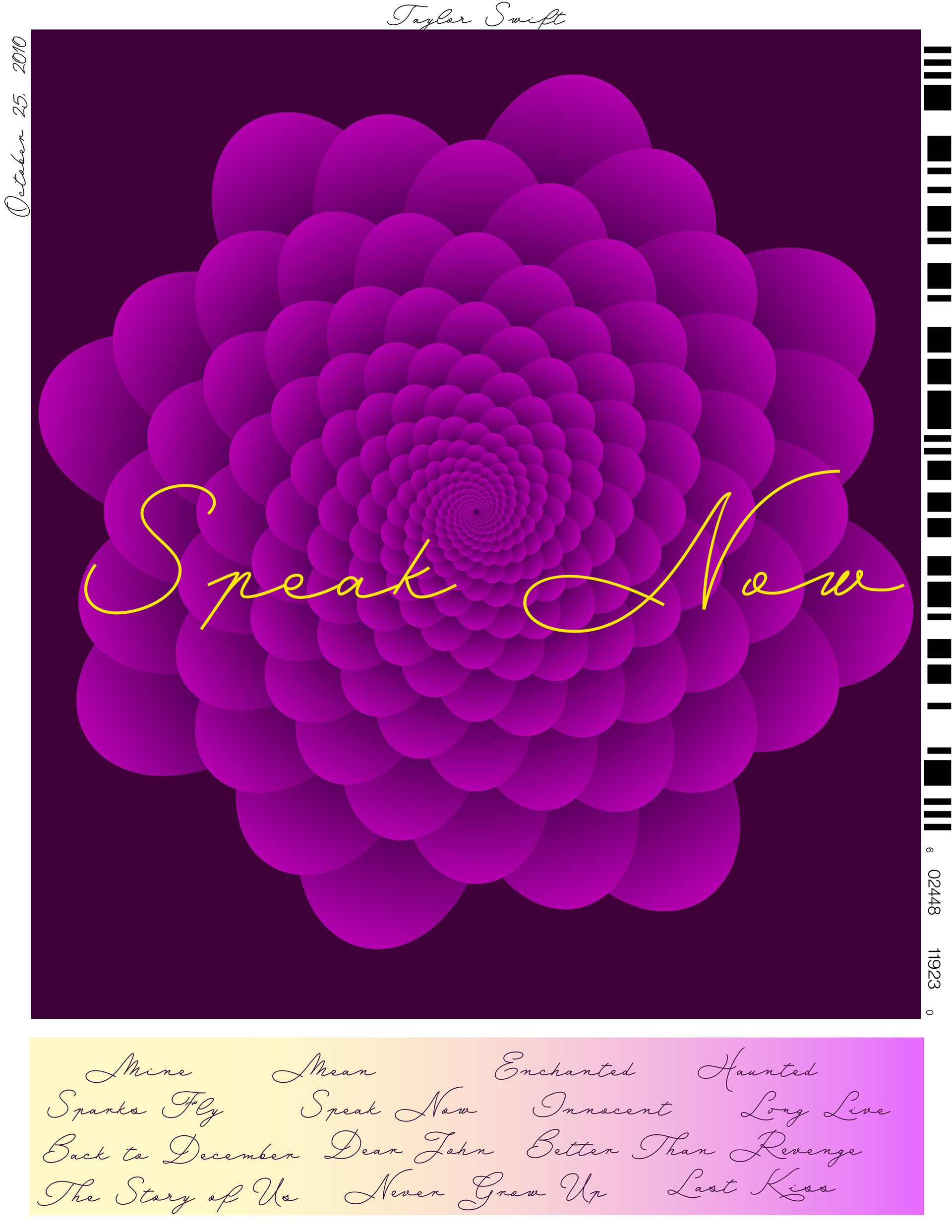
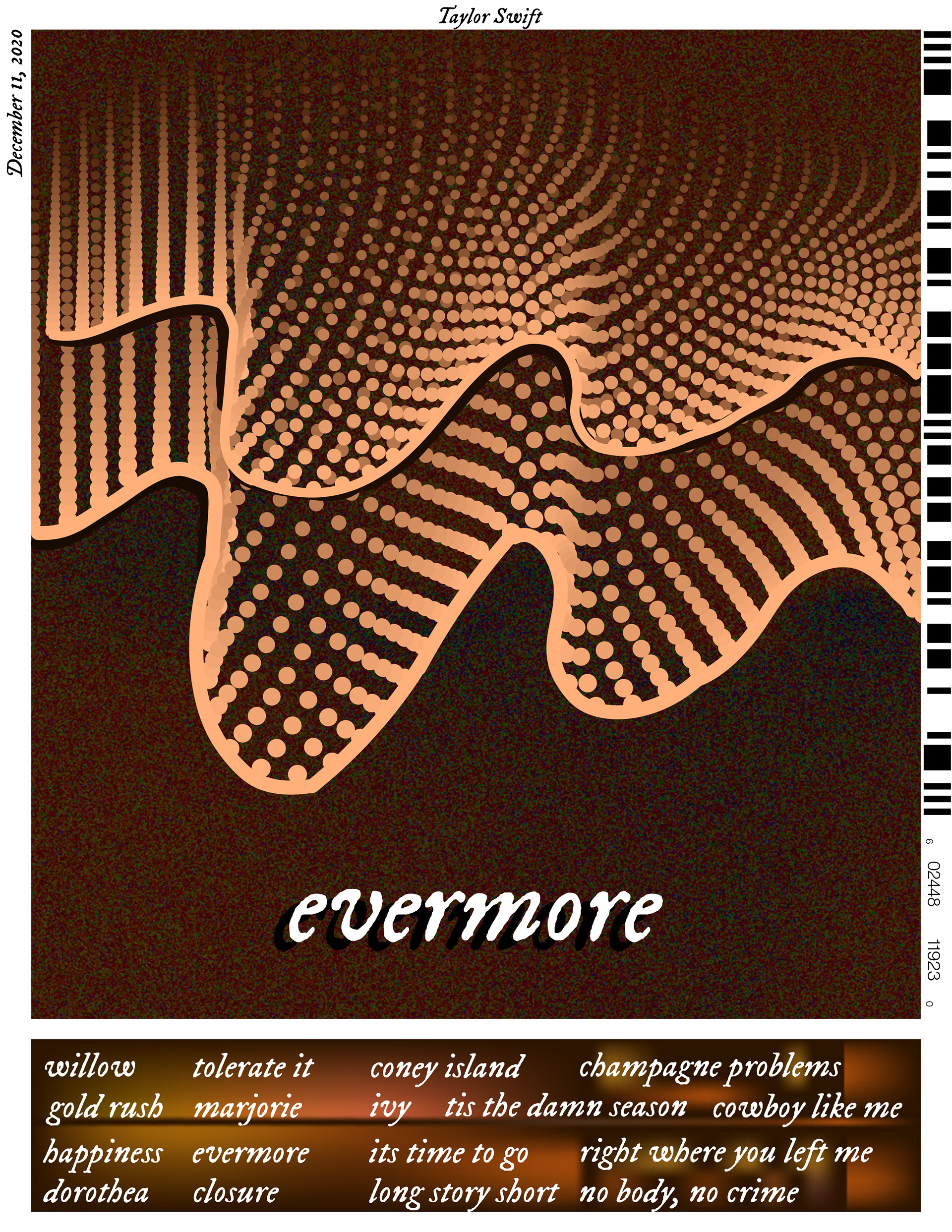
Pattern
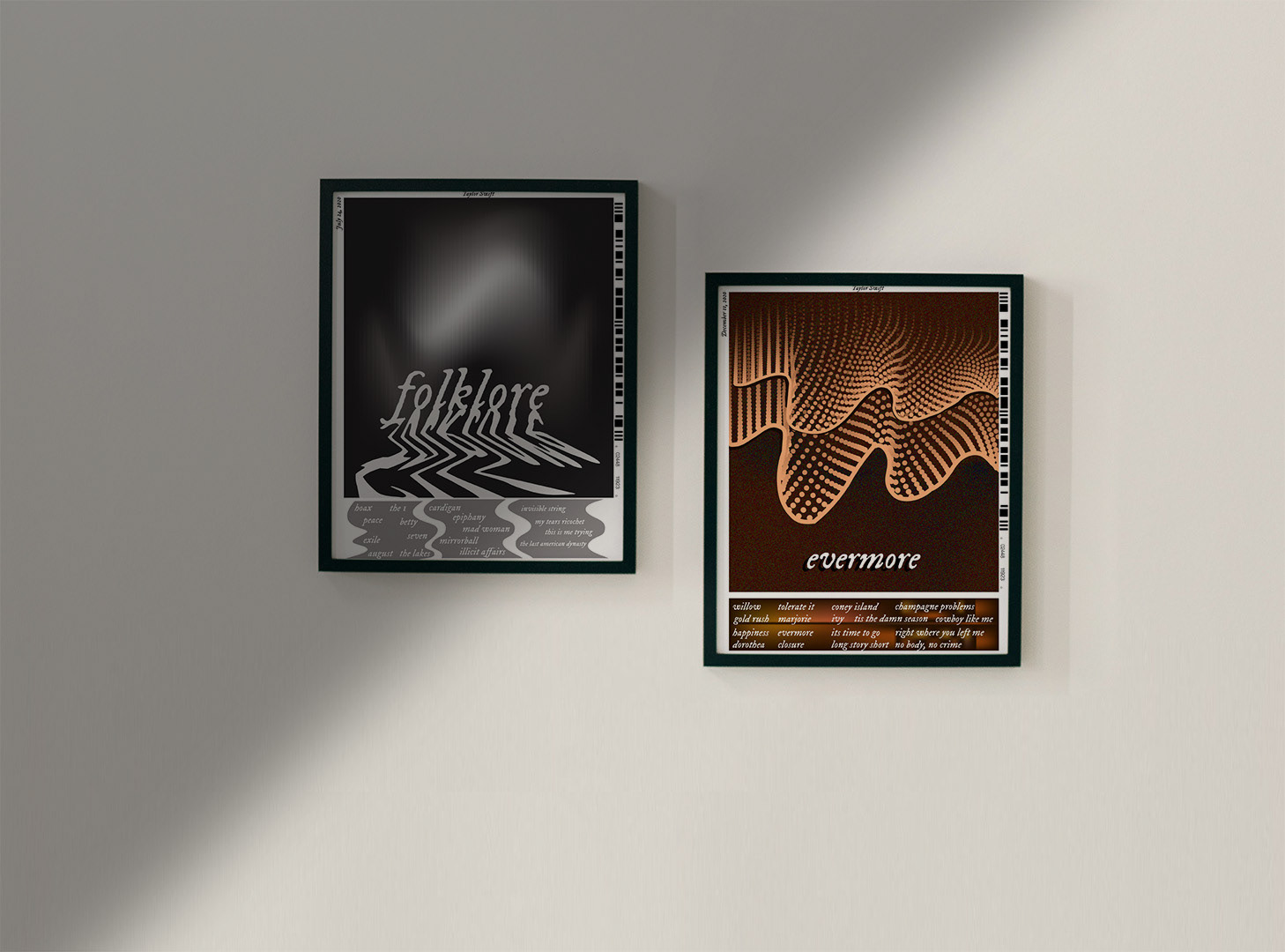
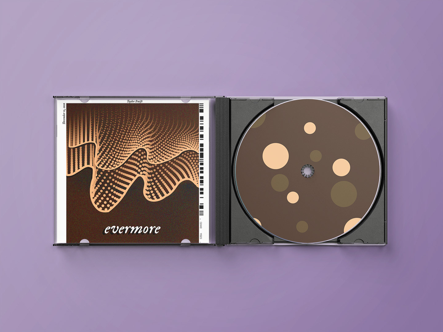
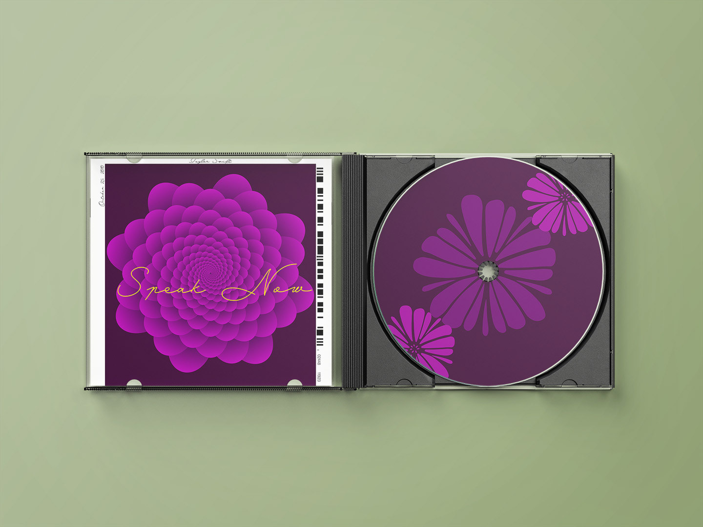
Speak Now and Evermore were the chosen albums for this principle. They both turned out amazing. For Evermore, I created a scribble and then turned it into a pattern using circles. I wanted it to look like a wave or a spectrum. A very subtle detail that you might miss if not looking closely, there is a slight grain effect applied to the background. I think that tied the cover together well. The tracklist is based on the original cover, she is wearing a scarf with that pattern so I thought to include it to pay homage. Speak Now, I created an intricate flower pattern to show how Taylor was blooming as an artist at this stage. I kept the colours pretty similar with that one.
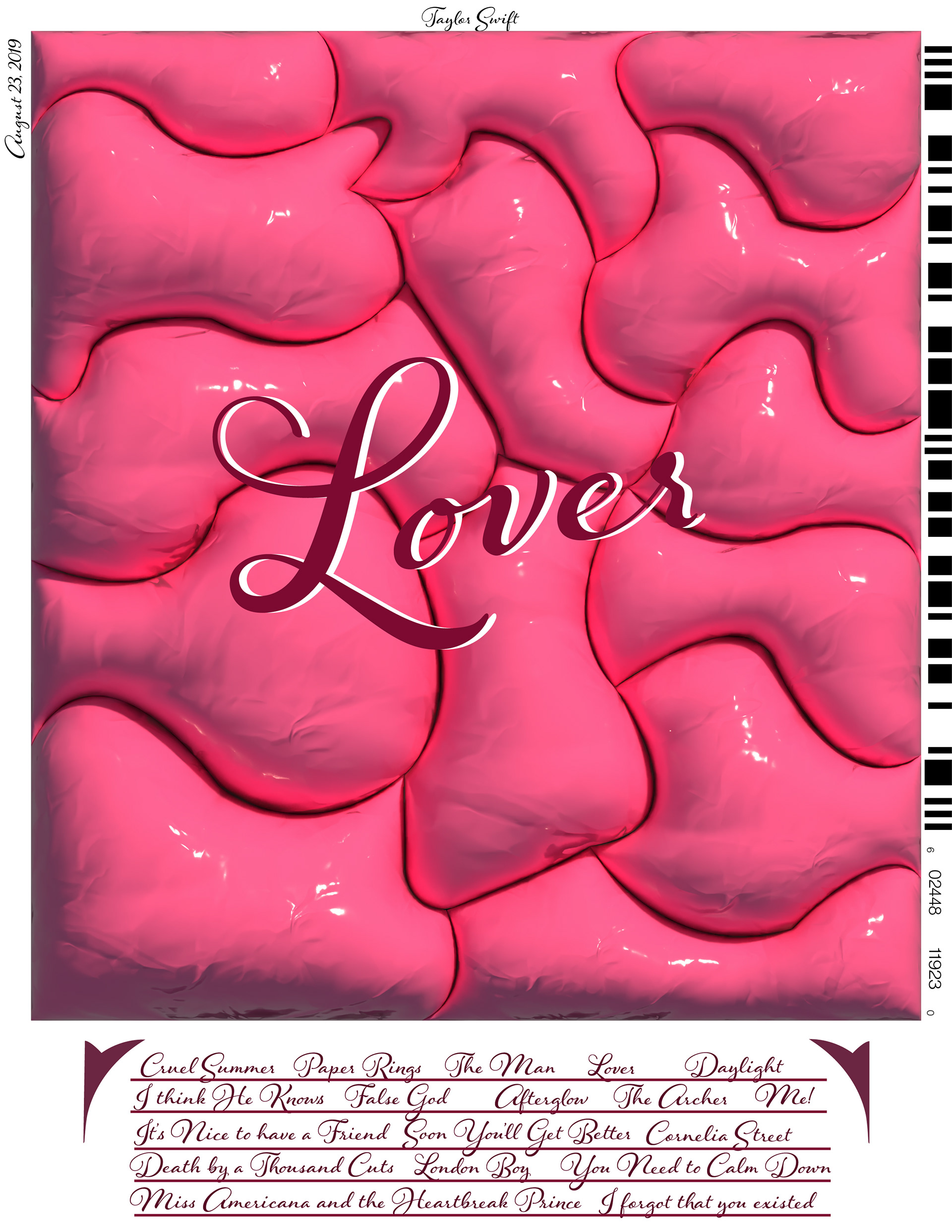
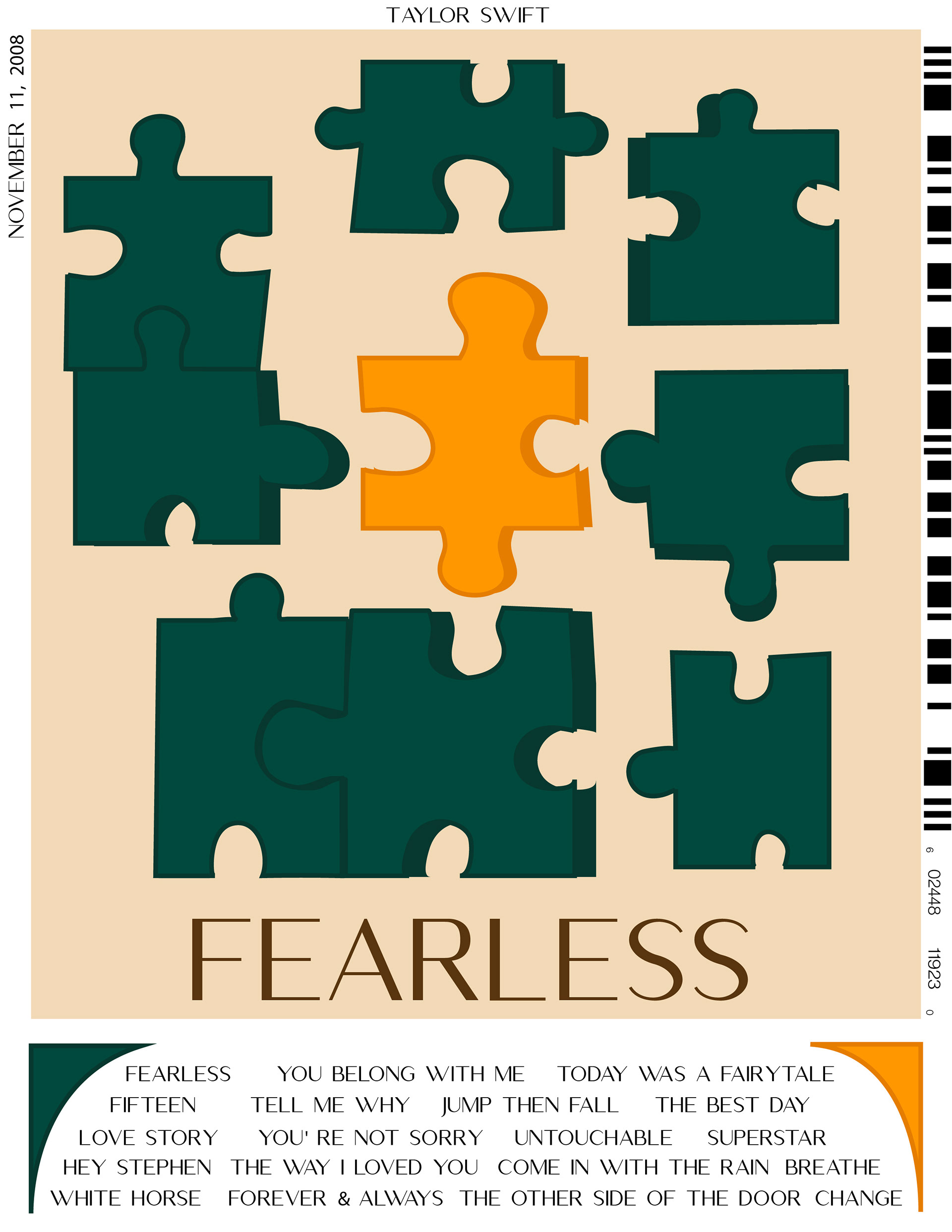
Contrast
Lover and Fearless are the albums for the principle of contrast. With Lover, I wanted to use contrast in a different sense than just colours. I decided to contrast the elements of 2D versus 3D. The background is a 3D-inflated collage that could be likened to that airy, high-phase individuals might feel when they are in love. The title then is in 2D with the original font, but I added some drop shadow to enhance it a bit. I went more traditional in contrast with Fearless, using vivid colours with one outlier. I made a puzzle set because I knew it would allow me to have one piece stand out.
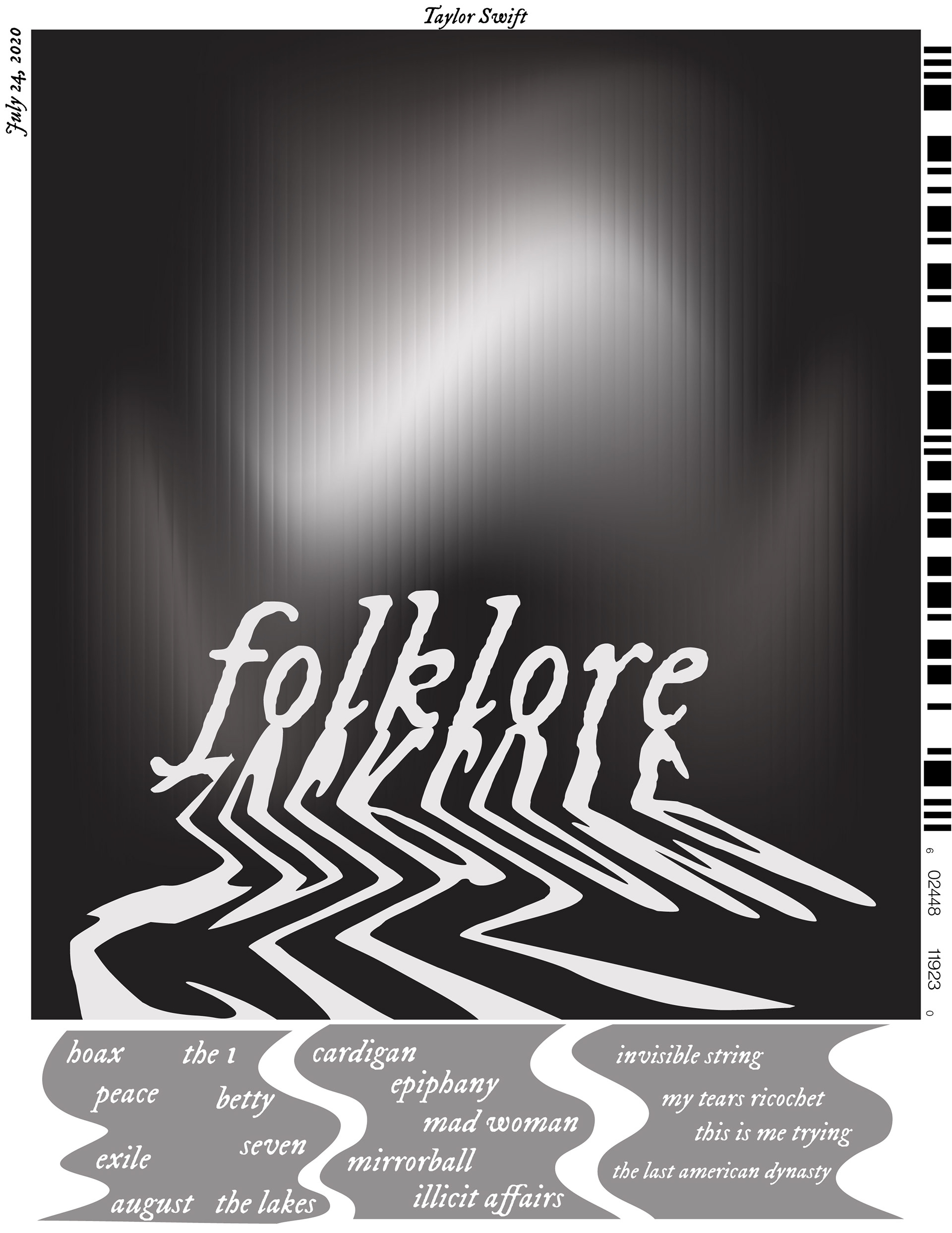

Rhythm
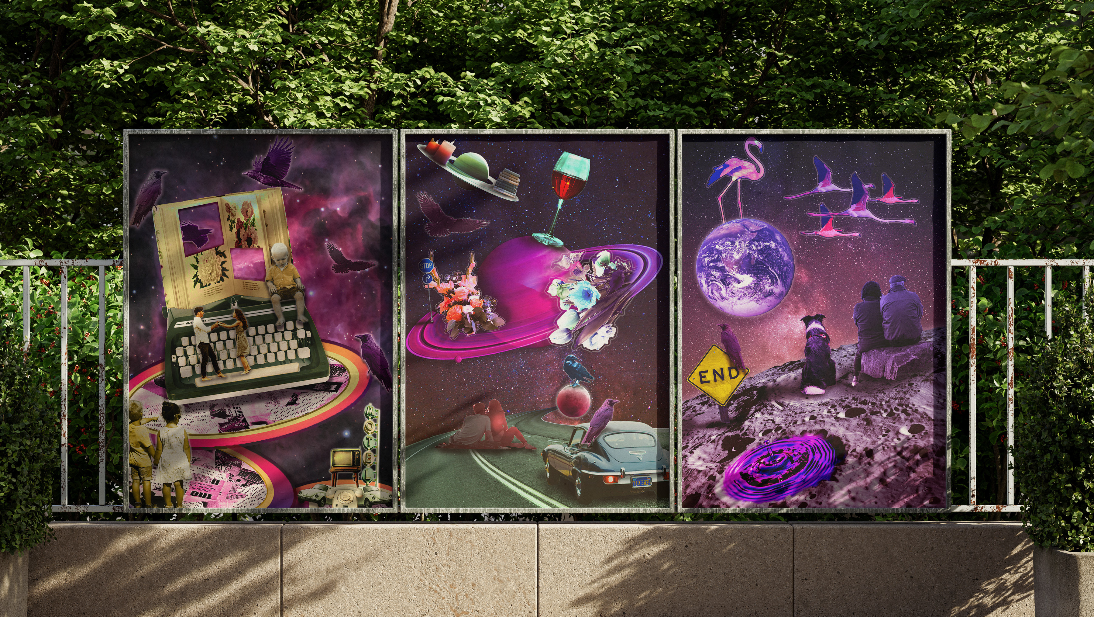
I had a lot of fun with this one. Folklore was an album that flowed so well together, which is why I leaned into that aspect. I wanted it to feel like the rush of a waterfall only to drop slowly into the calming presence of a river. For the background, I created a glass effect in Photoshop and then applied it on top of the white/black gradient. Overall, it encompasses the principle of rhythm by guiding the viewer through the piece.