Being able to work with the STEP team at Alberta Children's Hospital (ACH) was an opportunity I will never forget. I appreciated how much fun it was to work on this rebranding process with such amazing team mates and clients. Through this process, we targeted fellow healthcare workers and out-patient clinics. The work we sent in to the STEP team was done to our utmost abilities in order to leave them in a better spot than when we started working with them.
Sundae Studio
My team consisted of me and three of my fellow talented designers, communicators, managers and collaborators. We depended on our internal communications as a group, so that we could give our client clear directions and materials that were well prepared.


This was the original logo for the STEP team. It is definitely a bit hard to make out what is on and around the kangaroo. Overall, STEP needed our assistance with updating their logo, creating promotional materials for the rebrand and helping them create a new retronym for what STEP stands for. Originally, STEP stood for: Specialized, Transitional, Education, Personnel. They felt hospital staff and patients did not understand fully their role with this original retronym.


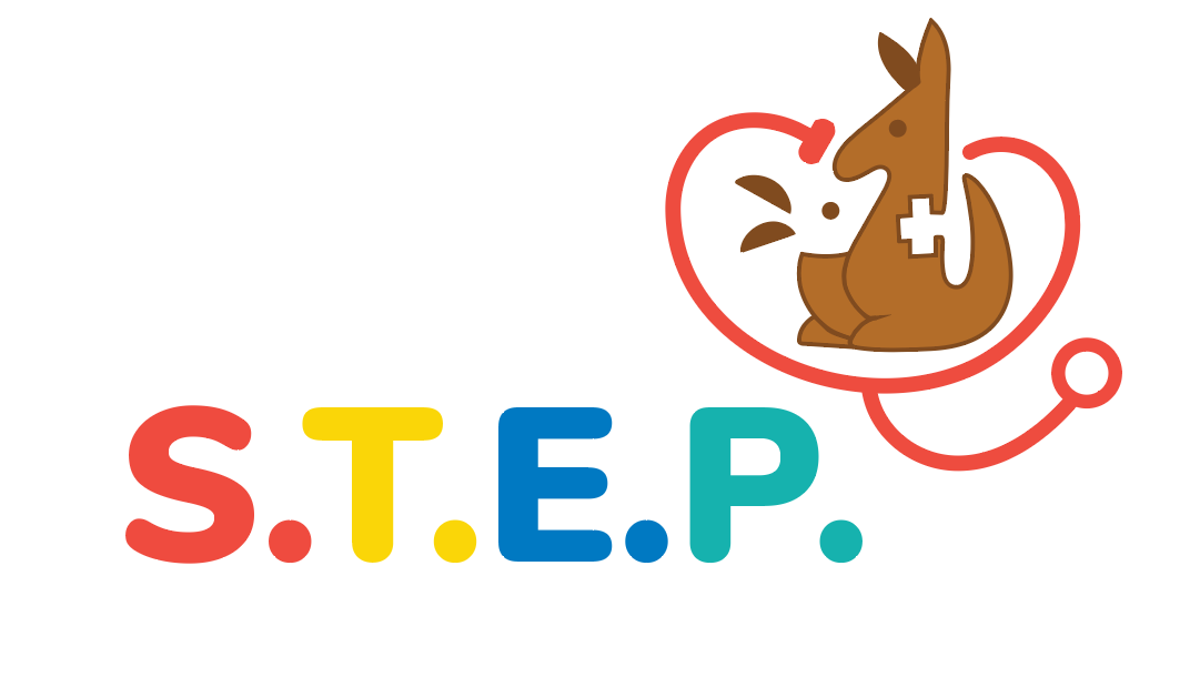
These are the final two logos my team prepared for STEP based on various feedback cycles and revisions. The one on the left is their primary logo, to be used mainly as the front and center of their team. The one on the right is their secondary logo, to be an alternative option for any printed materials and templates. Of all the options we prepared for STEP, they preferred and gravitated toward this design. They did not want to stray too far from the original concept but embraced this new, modern look. The final updated retronym we provided for them was as follows: Support, Team (for) Emergency Prevention. Based on feedback from internal staff and patients, the STEP team provided us a list of words that individuals thought STEP represented. We chose among those and came up with a simplified and understandable acronym that anyone can decipher. They absolutely loved our choice and can't wait to implement the new terms!
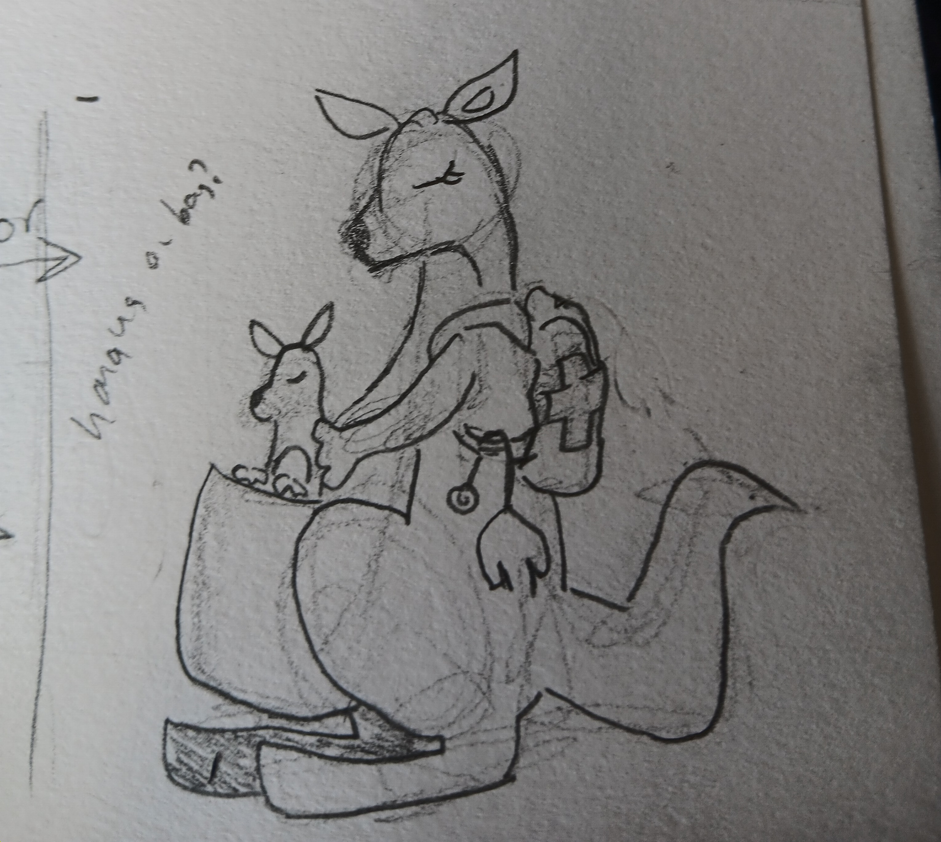
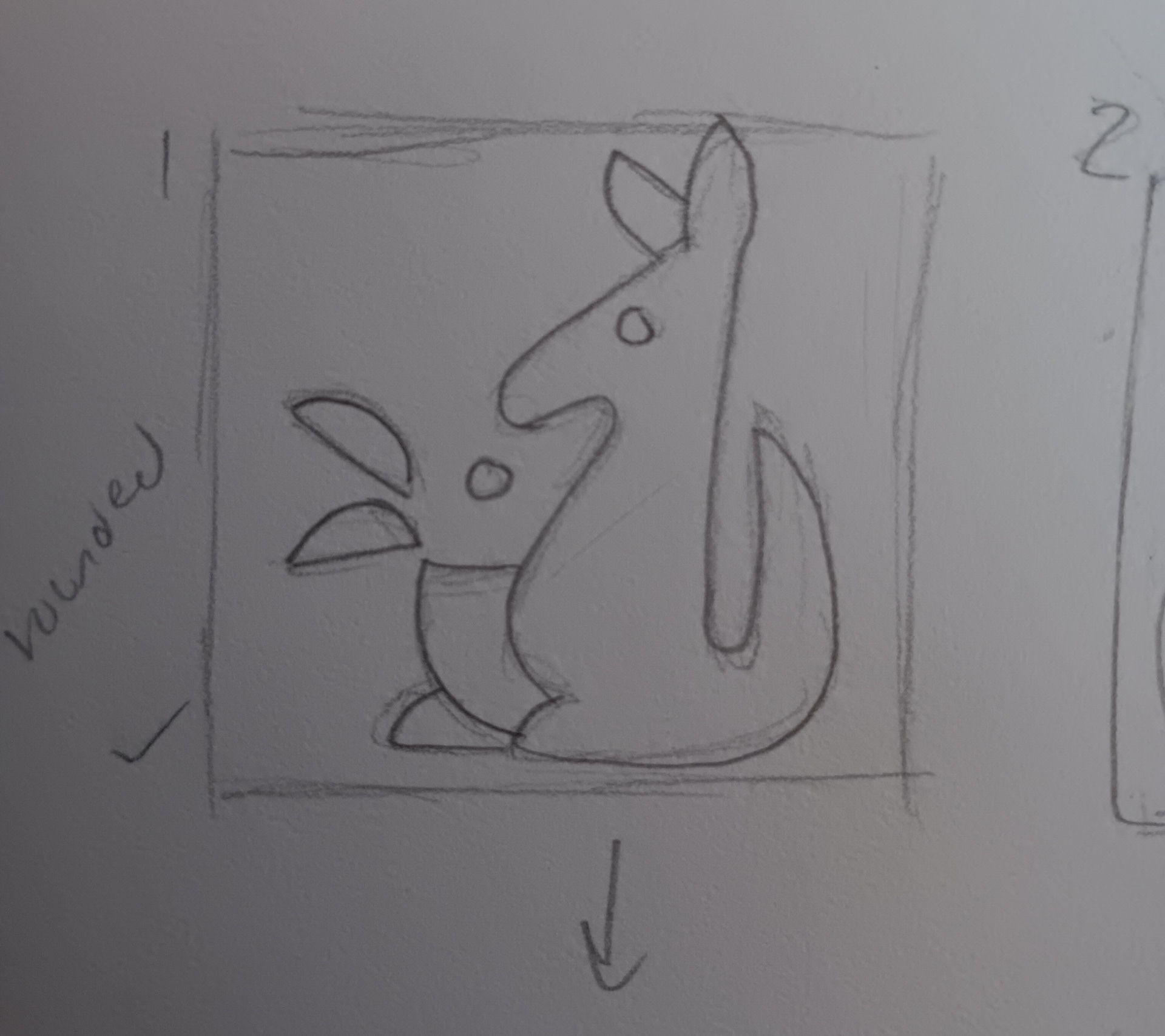
These are some of my initial sketches for a potential new design. They really wanted to keep the kangaroo and joey aspect, to have some familiar elements that staff and patients would recognize. I went for a more modern, corporate version on the right and a more detailed but friendly look for the one on the left.

After importing my sketches into Illustrator, I started to work on vectorizing and making the logos come to life. I decided against working on my second option because it ended up becoming too complicated with all the little details. This logo option was simple and easy to work with and I was even able to create versions with different colours. This was the final design I sent in for STEP to review. Of course, even though they did not choose mine, I am still proud of the version I came up with and the other aspects of this project I had the pleasure to work on.
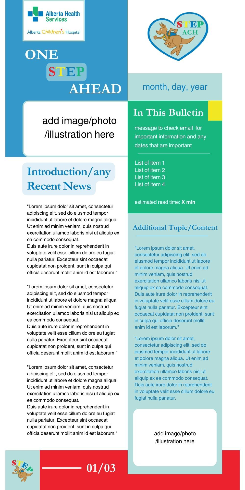
I took point on updating STEP's current digital newsletter. They send out an internal newsletter to staff to highlight important events, dates and things going on around the hospital they should be aware of. I made sure to incorporate the new brand colours and logos. I wanted to make it a fun, bright and eye catching design. I gave lots of ample space for them to input their information on there. Designing this in Canva gave me the chance to be simple with my layout and also ensure everything was editable for them. I included their newsletter name, One STEP Ahead. The page shown on the left is the homepage or initial page of the newsletter. It allows for a summary or introduction of what this week's or month's letter is focusing on. There is room for them to put the immediate items they will be diving into. I made sure to include an estimated read time, I find that that is helpful for any email or digital layout. Knowing how long, roughly, your information can be digested is important. It can determine whether more people read it or more people skip it. The number of pages indicated on the bottom can also be an estimate of how long it might take someone to read through the whole newsletter. I have included a link to the full STEP Newsletter in Canva, as each page gets pretty long in length.
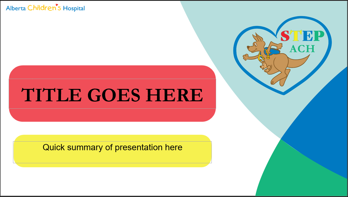

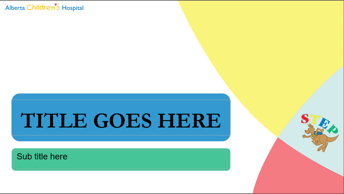

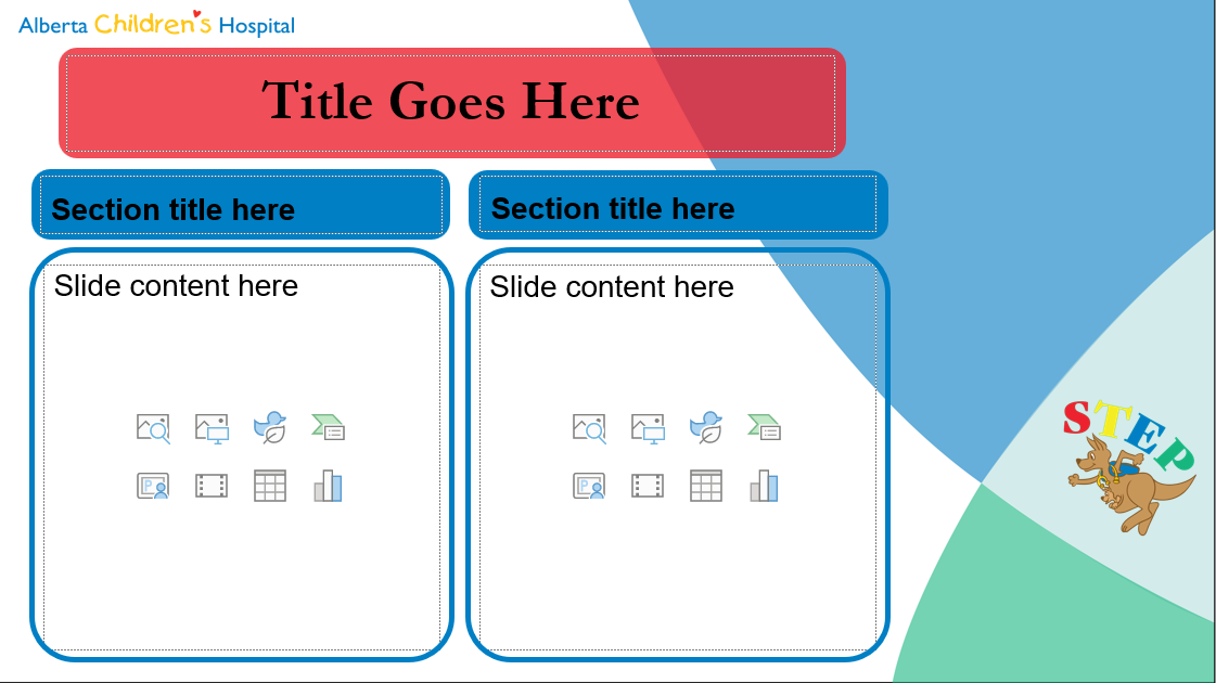
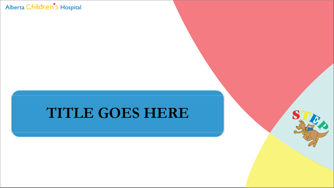

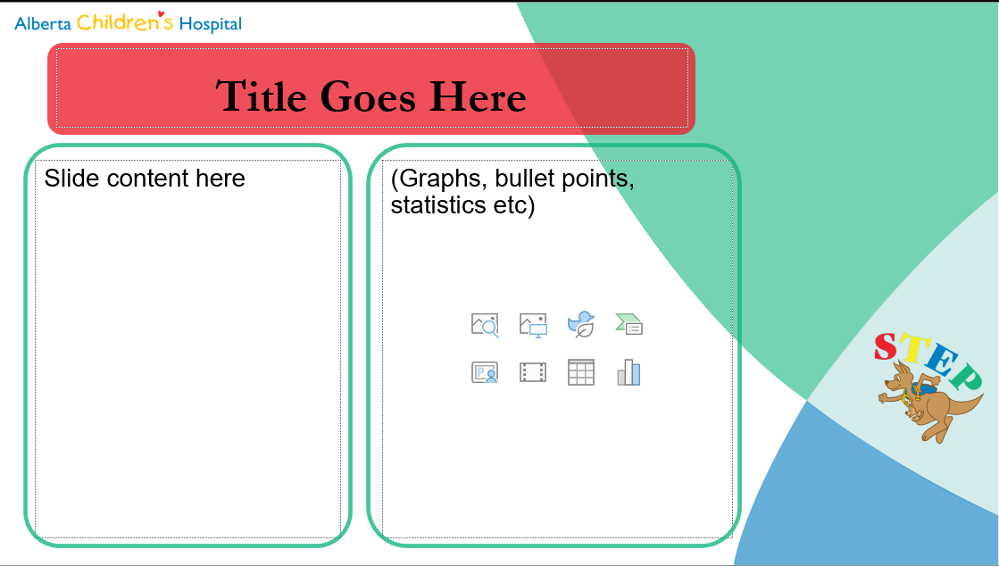
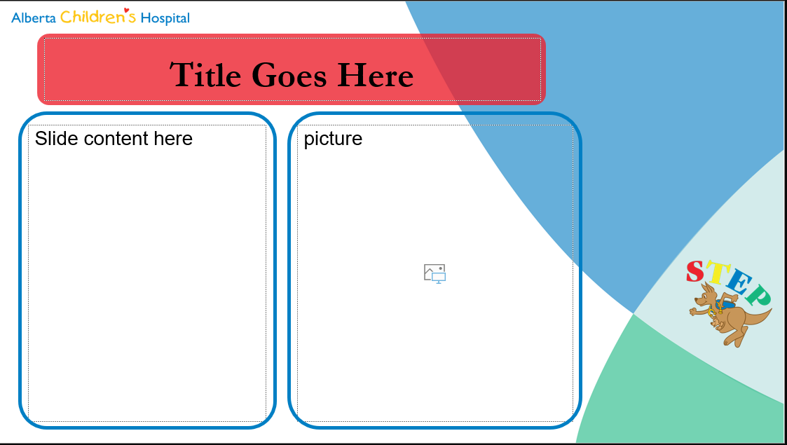
I was also in charge of creating a PowerPoint template for the STEP team to use when they are at conferences or doing a presentation to families or an out-patient clinic. I went through a couple of revisions and feedback cycles, before landing on this design. I wanted to keep the layout simple and easy to use. I made sure to include the ACH logo as well as the STEP logo to really solidify their rebrand. This photo grid contains screenshots of the actual PowerPoint template, hence the text boxes and placeholders. Learning to create a design for PowerPoint was a process. I started off designing in Illustrator and then I imported the design into PowerPoint. I made it so that the STEP team can edit the elements on the template like the logos and the background colours/outlines. If they want to remove certain elements, they can do so. The logos are both free form, so if they need to take up the whole slide with an image or some data, they can simply place them on top of that. I made sure to create a versatile design that would hold up for years to come!