I had the best opportunity to work alongside Crooked Cinema Inc for my practicum this final semester at SAIT. I knew someone who worked there, a previous instructor of mine, and I was able to reach out and get some practical work experience! I assisted Crooked Cinema with quite a few things. They needed help with video compositing and editing. After I finished up with that project, I was helping to conceptualize an idea for a podcast logo. I had a blast working with my mentor and getting to create some pretty cool final designs!
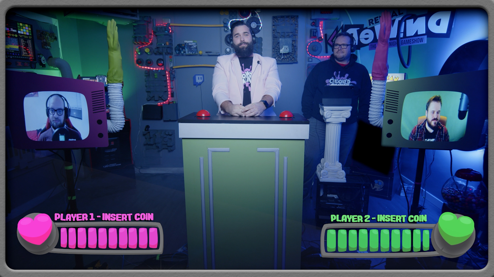

I was initially tasked with helping to remove a logo from an episode of Rental Rewind season two. The twitch logo on the image to the left, had to unfortunately be removed due to copyright issues. The image on the right is what it looked like after I removed the logo from the episode. These are just still images, I can't include any clips until the second season is officially out. It was definitely a process. I had to mask out the logo, apply a still image that already had the logo removed, and then rotoscope the host back onto the footage. I utilized Premiere Pro and After Effects for this process. I rotoscoped and masked in After Effects and then threw the rendered AE compositions back into Premiere. It took a majority of my hours to get this system down pat, but once I did it was a nice routine. The episode I edited was episode two of the season which was about thirty-five minutes long. I can't wait to see the final result when it releases!

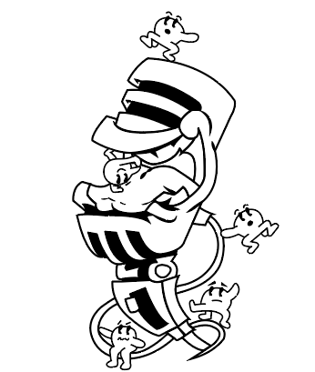
The second project I helped Crooked Cinema with was coming up with some potential branding for a podcast they want to explore. On the left is some of my initial sketching and notes. I thought it would be cool to create like a microphone monster with these little characters all around it. In a nutshell, the characters are "sour" and the microphone monster is addicted to them, hence the open mouth, wanting more. They wanted the podcast art to feel retro and vibrant, so I attempted to follow that direction. I then uploaded my sketches into Illustrator to start vectorizing and cleaning up the design a bit.
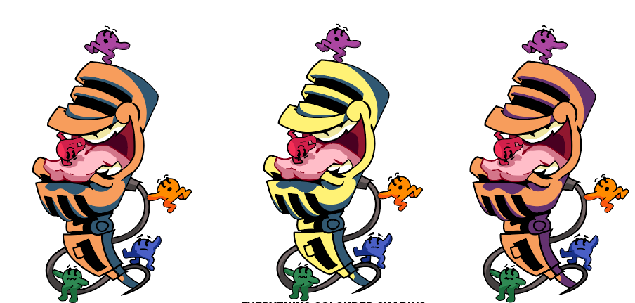
After playing around with colours and what looked best against each other, I landed on these as my top three choices. I was inspired by the Nerds candy, a bit of the Little Miss characters and the Toxic Waste candy branding. I landed on this cool compilation of styles that work well together. I wanted each little character to have its own distinct colour, to set it apart from the mic monster. This is definitely my favourite design so far, it gave way to a lot of creative freedom and I appreciate Crooked Cinema for not shying away from that.
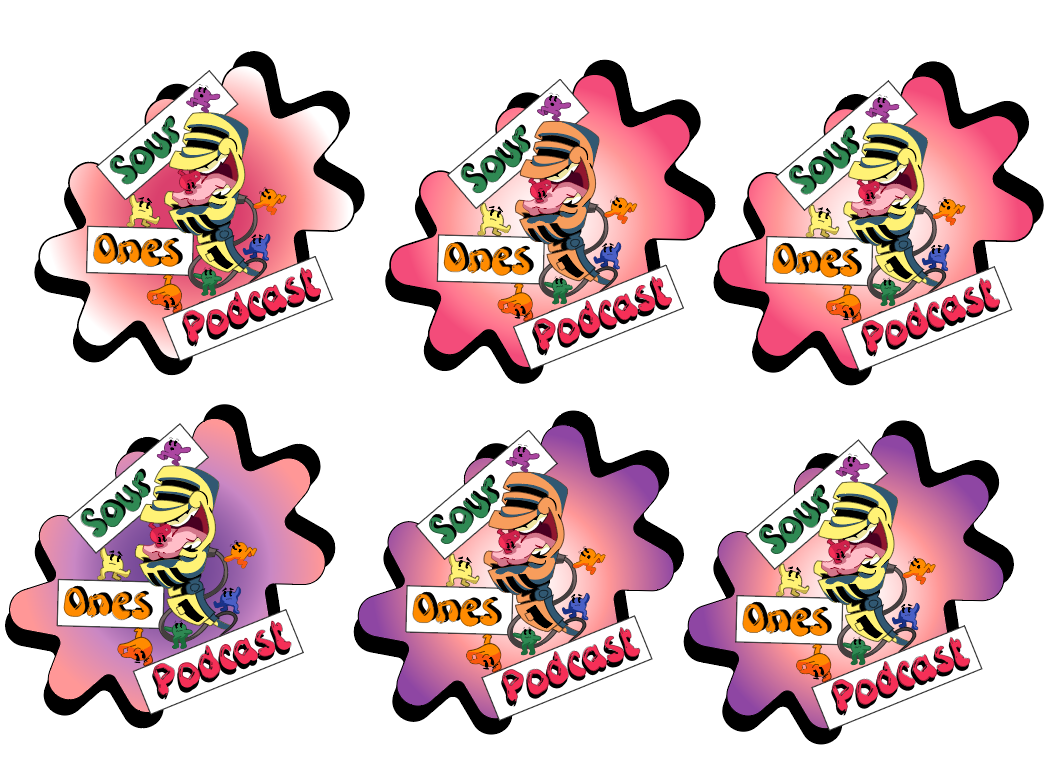
After I found a unique looking font, I started to play around with a background element. I liked the idea of a splatter being behind the design. I had it being a flat colour initially, but I found that did not give me as much satisfaction as I had hoped. I figured it just needed something a bit more extra, so I tried a bunch of different gradients. These looked closer to that end result that I wanted. I had a lot of fun mixing different colours for this part of he process.
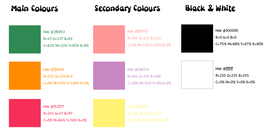
This is the colour breakdown I created for them. This will be helpful when they want promotional materials or when they are simply needing to remember what colours to use where. I did include black and white because sometimes that is the best option for text. Hopefully they can use this in the future!
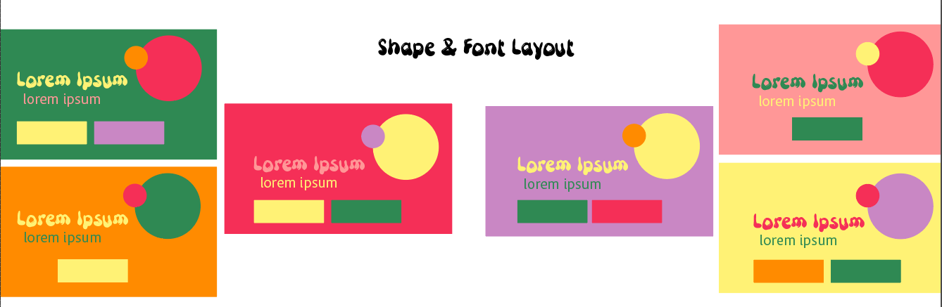
Lastly I created this shape and font layout breakdown. I figured it would be useful to know what colours look best on what. Since they have two sets of colour schemes, the main one and then the secondary one, I wanted them to know how to use them. Seeing how the fonts are laid out as well can be useful, in terms of legibility and hierarchy.