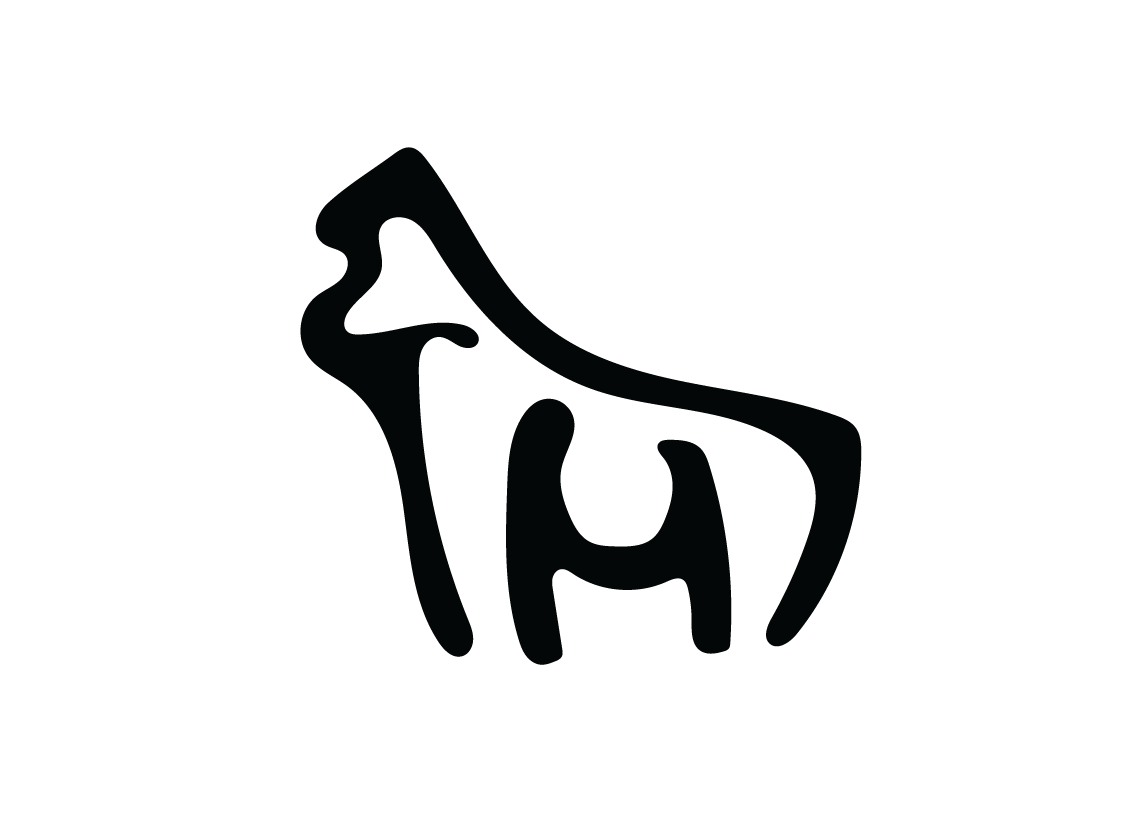
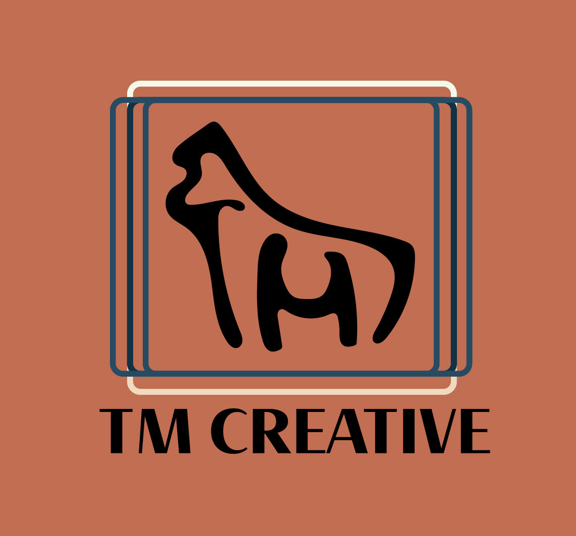
TM Creative is my personal brand's logo and design. This is the face of my website, business cards, and personal-branded projects. I created this logo for a final assignment in my visual communications class and hope to expand my work opportunities with it. I wanted to make it super creative and have hidden letters in it since I love that style of logo design.
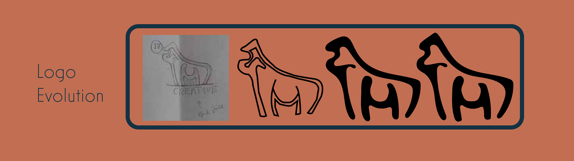
With my base sketches completed, it came down to what I could envision as the face of my personal brand. A lot of my other options were super corporate and blocky. I realized by looking at them that I was designing for the industry and not for how I wanted to represent myself and my style. After asking for feedback from instructors and classmates, I chose to go with my ape design.
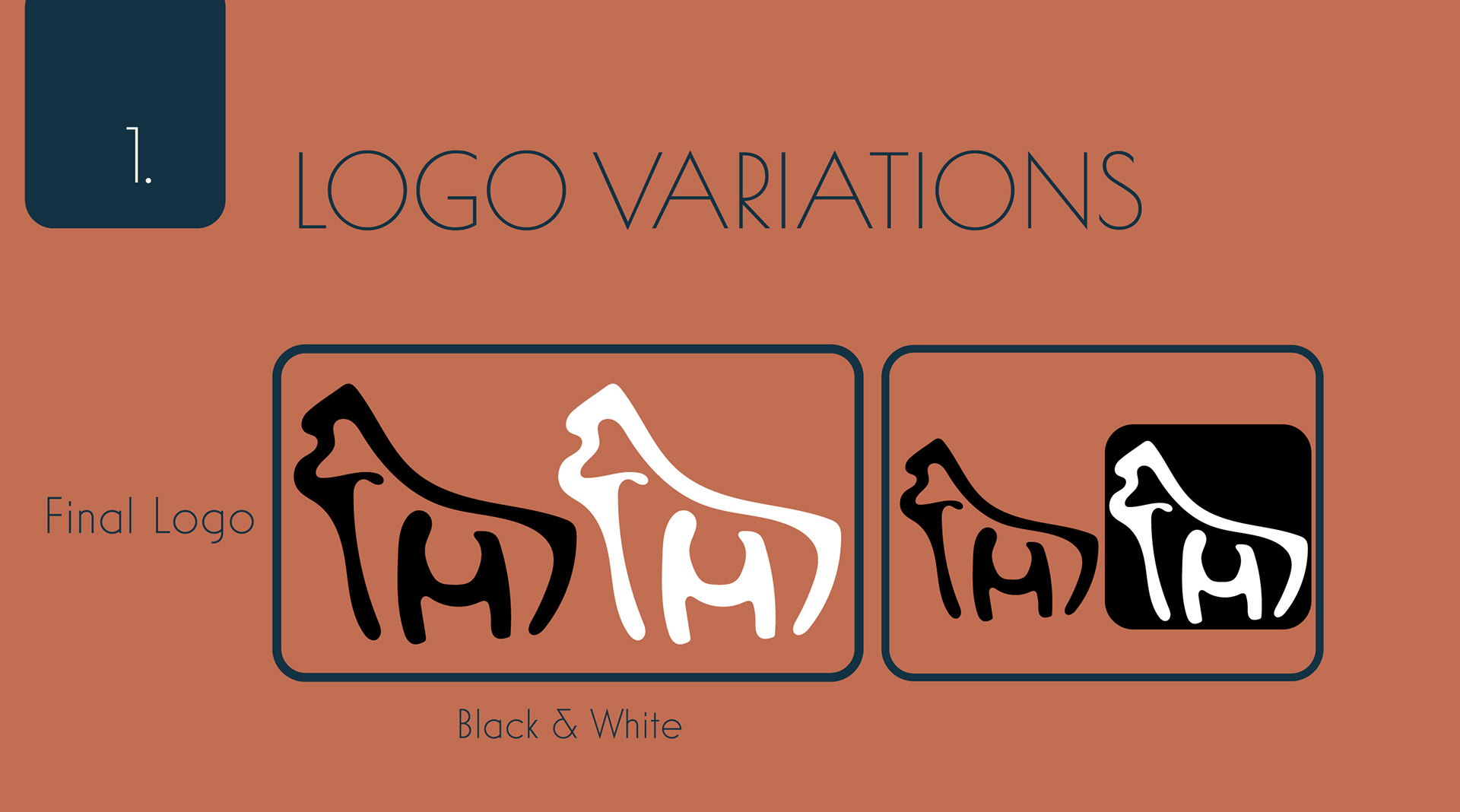
This first page of my brand book showcases the development of the logo. It was able to capture my initials, TM, as well as provide a cool-looking mascot in a way. I went through a couple revisions before landing on my final design. It was a lot more blocky and square, so I rounded out more corners to give the head more shape. My final logo is something I am really proud of, and I feel it captures who I am perfectly!

I went back and forth on whether to have my brand name be in black or the dark navy blue. I think I was able to create a pretty versatile logo that can have a variety of colours applied to it. So if I have the black logo, I could do black text or choose from my six other brand colours. The nice thing about my colours as well is that they work so good together. I can pretty much make my logo any colour from my brand and it will fit on top of the others.

This page in my brand book dives into my colour scheme and why I chose the colours I did. Overall, I was very attracted to the orange and blue contrast. It works so well together and makes this brand pop as my own. Since I created this brand book, I actually got to create this website as my portfolio. My choices with the colours differed from what I thought they would be. I love the boldness of the orange being my main background colour. It might seem intense to some, but I enjoy how it creates a solid base for the rest of my colours. I went back and forth on whether to have my lighter colour be the background with the darker as highlights, but it felt off when I tried it. I want people to see how my mind works when I choose certain colours and why I make the choices I do with my design. The final layout choices ultimately fit with my style and reflect my personality.
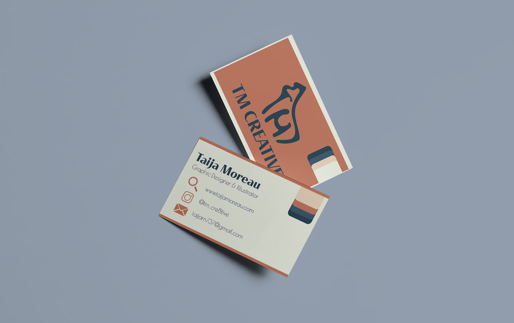

Front of business card
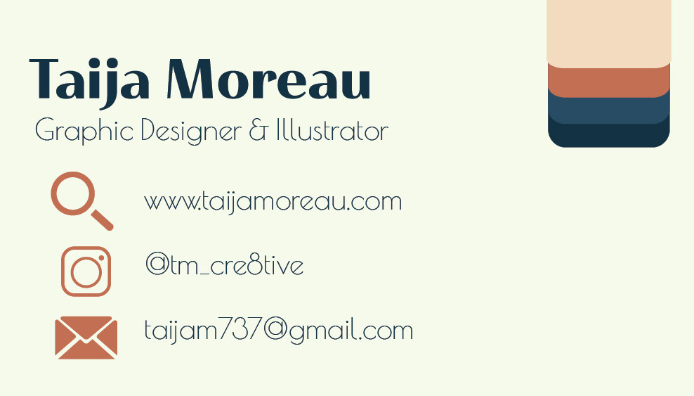
Back of business card
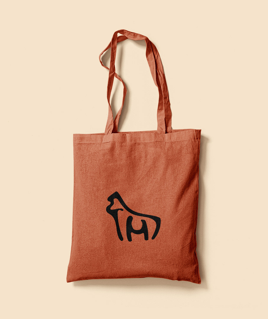
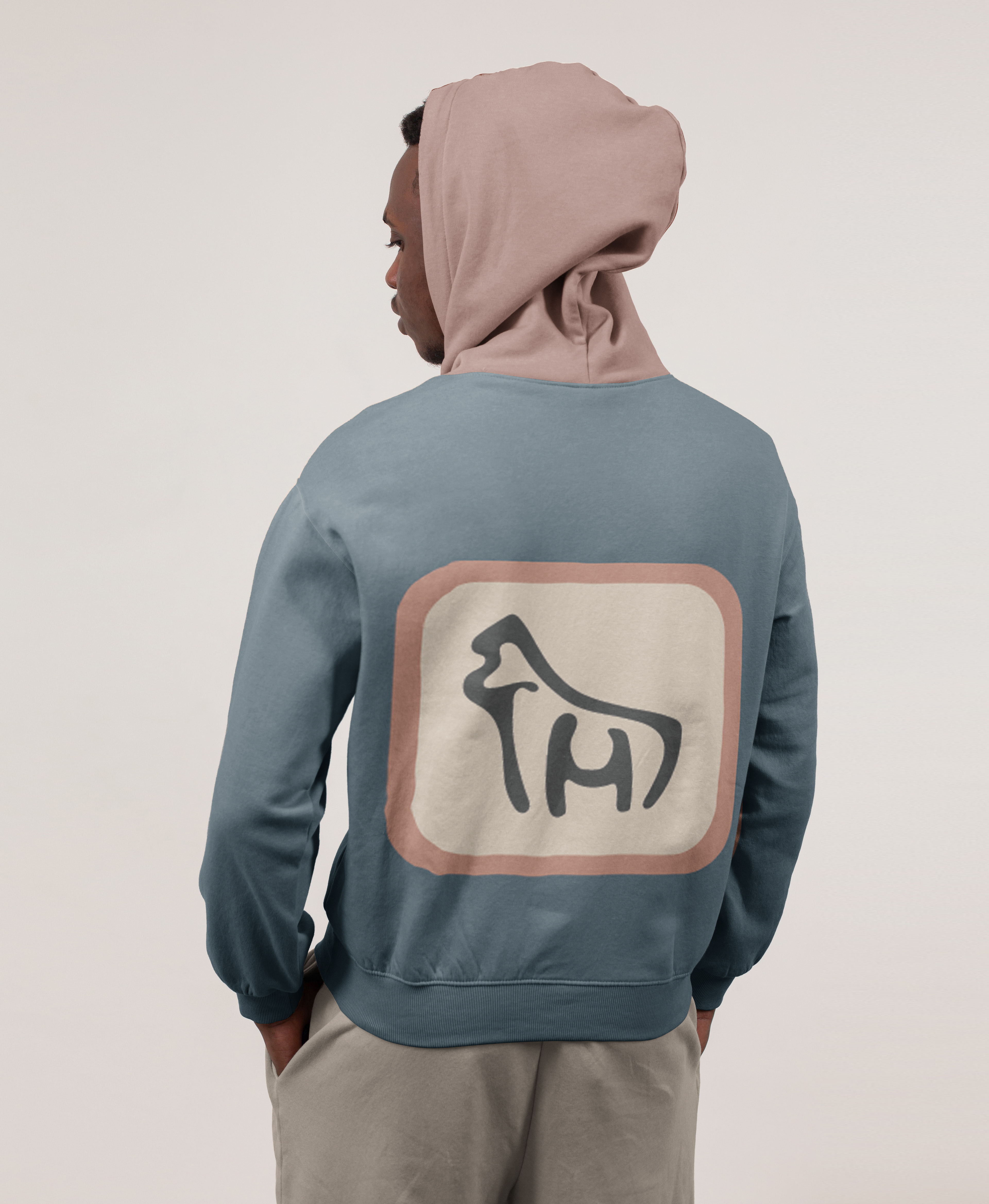
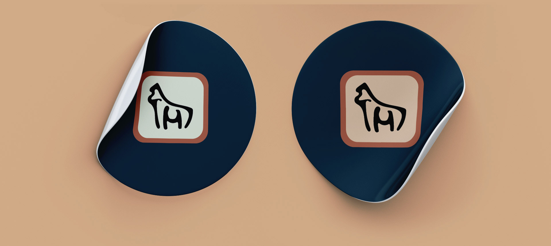
In order to showcase my brand a bit, I did up some mockups. Stickers are used quite often in the creative industry, along with business cards. So to promote myself, I know these are the top channels to do that. I wanted to incorporate all my brand colours on the business card in a way that was appealing and would draw an individuals attention. I kept the back side simple with my icons and my handles taking up majority of the space. I wanted my title to primarily be a graphic designer but also to include my illustration background and skills. I want to be a versatile designer and be able to provide companies and clients with a unique creative avenue. I personally like tote bags, I think they are convenient when you have to go out and get things done. I also love to throw on a hoodie as it is a comfortable piece of clothing and seems to fit any weather occurrence.