Mingle is a trendy social cocktail bar that invites all who are looking for a night of fun. I worked on this brief from @designerbriefs to improve my branding and visual unity skills. I decided to create some unique icons that brought to life the cocktail feel of this establishment. I put more emphasis on making sure this brand guidebook tied together with the colours and patterns. Creating the logo for Mingle was a cool process, I ended up combining two of my initial ideas to get the final product. I think this branding project is my most innovative so far, and I can't wait to work on similar projects in the future!
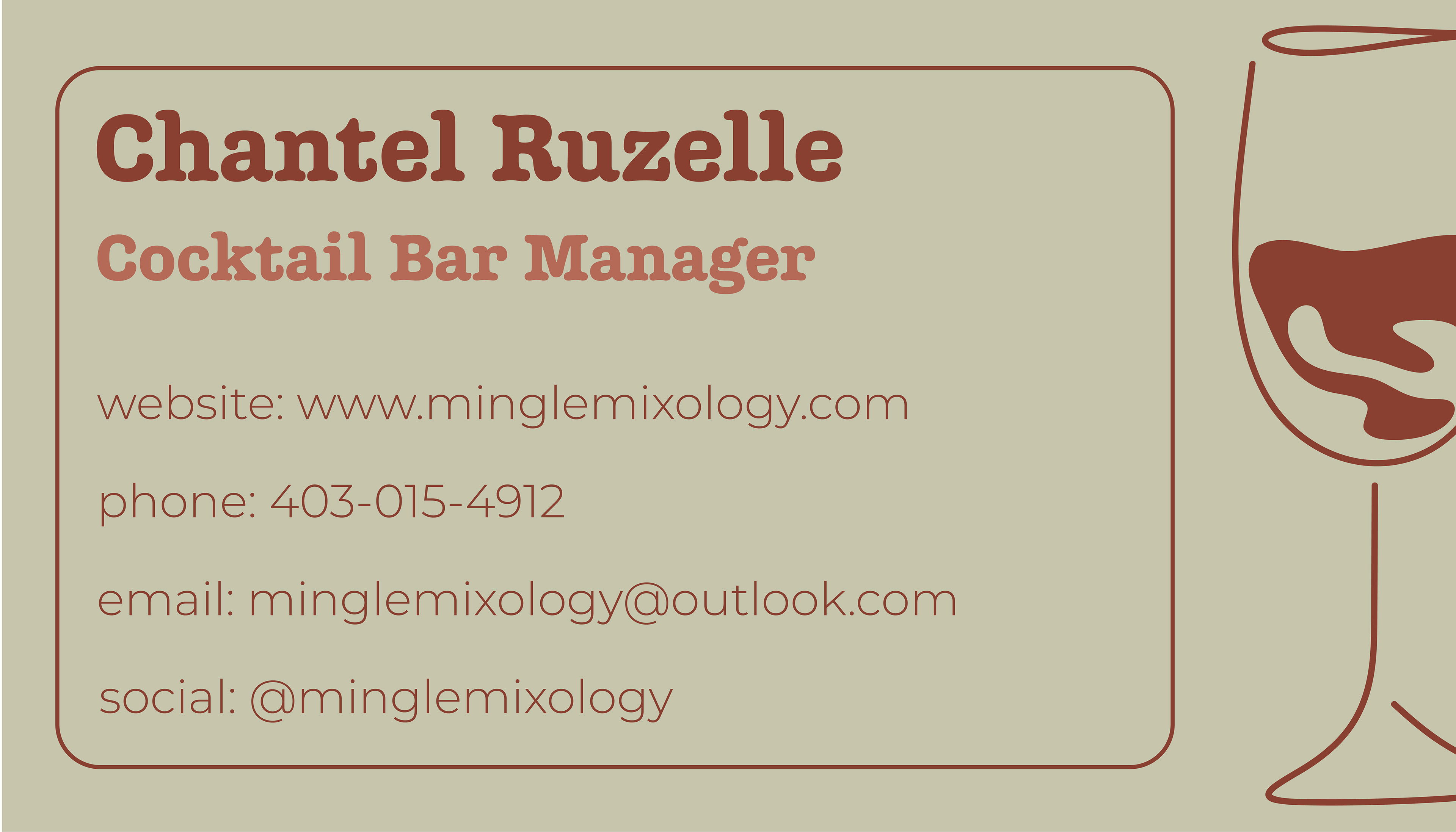

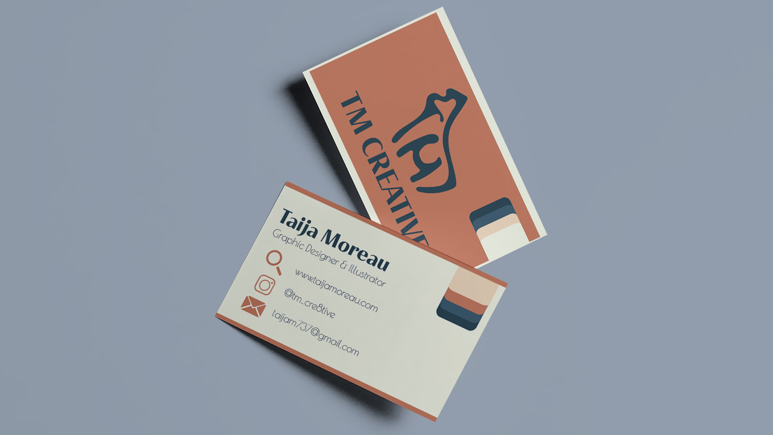
This is the business card design in a bit more detail. I wanted to incorporate the patterns and icons without it being too overbearing. I was able to make it look very classy with the details added. The use of lines and the line art cocktail glass icon create a sense of direction for the eye to go along. I wanted the front of the card to be catchy and fun, which is where I decided to use the brand pattern.
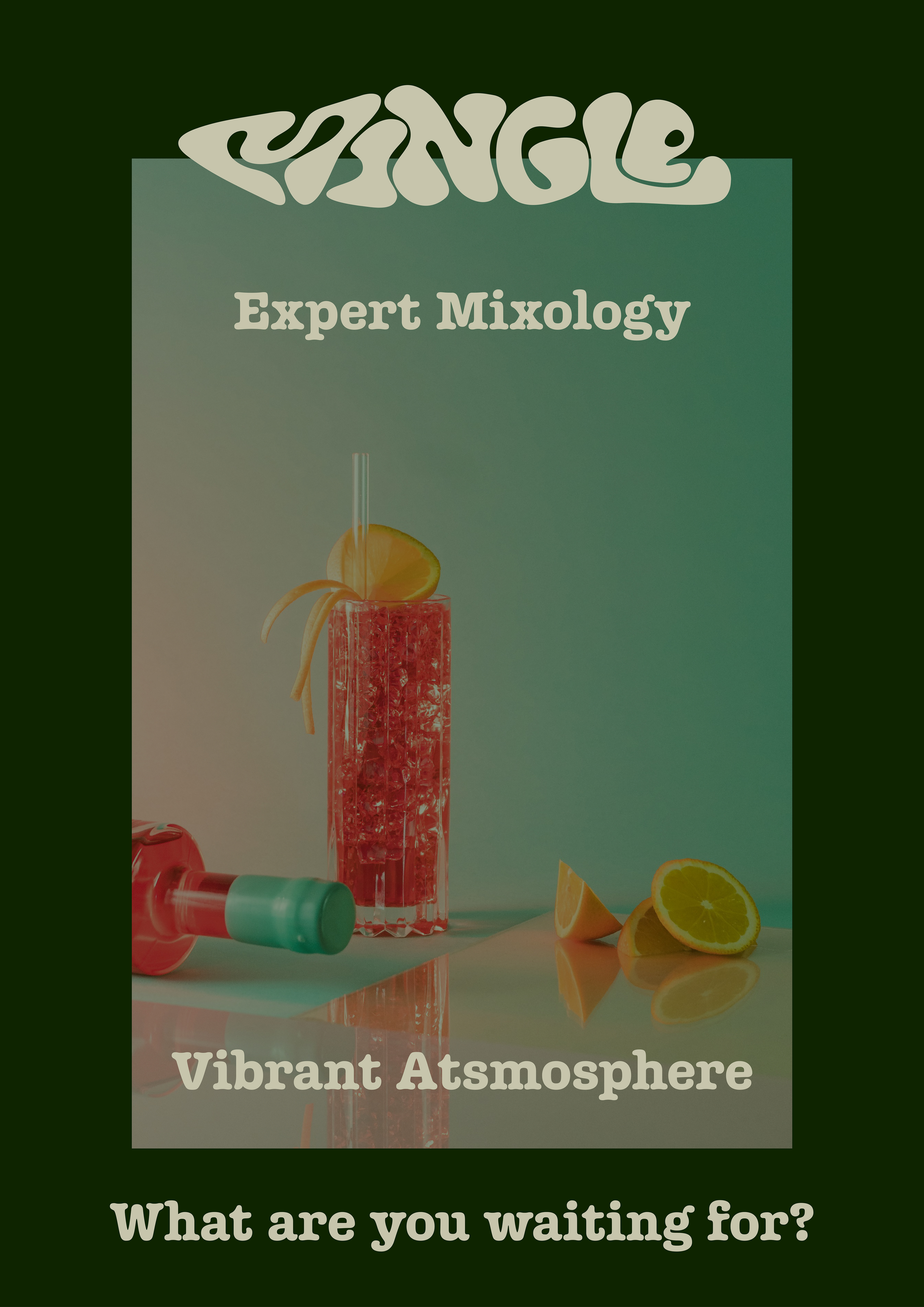
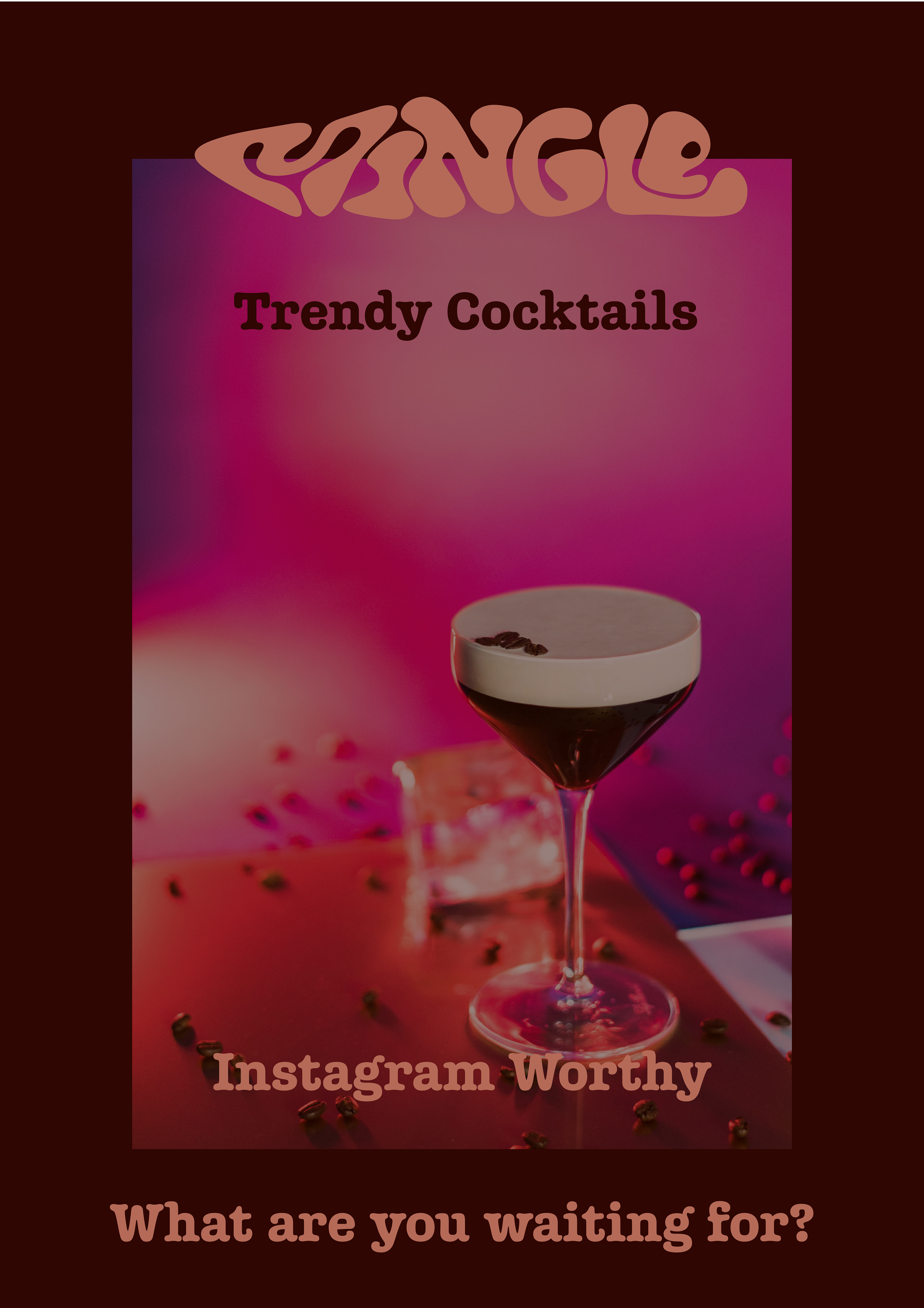

These are the advertisement flyers I designed in a bit more detail. I am proud of the consistency between them all. The way I was able to use the brand colours with the borders and the brandmark, works to catch the attention of an individual. I decided to use short descriptors to draw in the viewer, something that would entice someone to want to check out this new cocktail bar.
