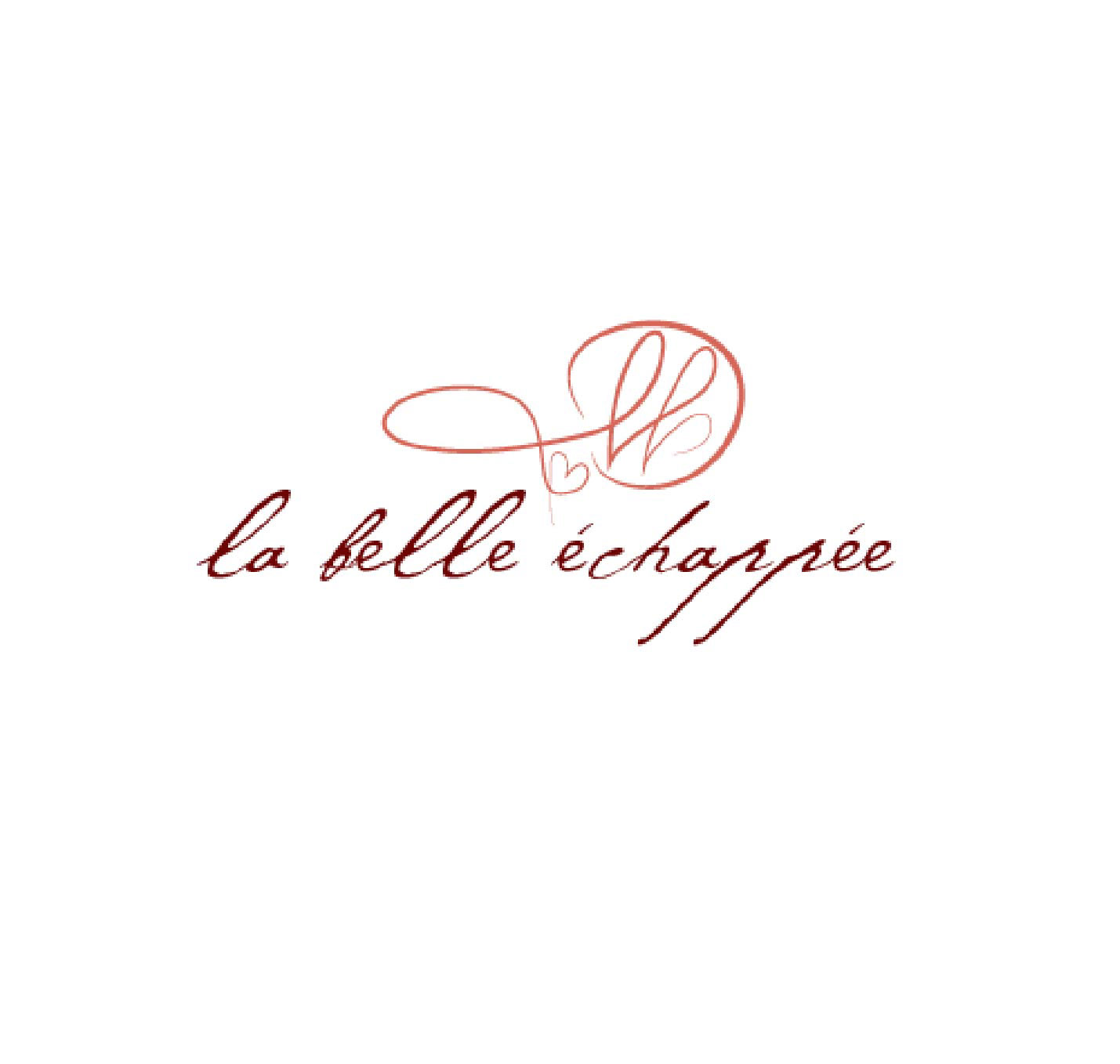
La Belle Echappee, translated to "the beautiful escape" in English, is a boutique hotel located in the countryside of France that aims to provide a relaxing retreat. This fictional company was created by @designerbriefs on Instagram. I was thrilled to take on this challenge. It is one of my first hospitality logo creations, so I was glad to get this practice in.
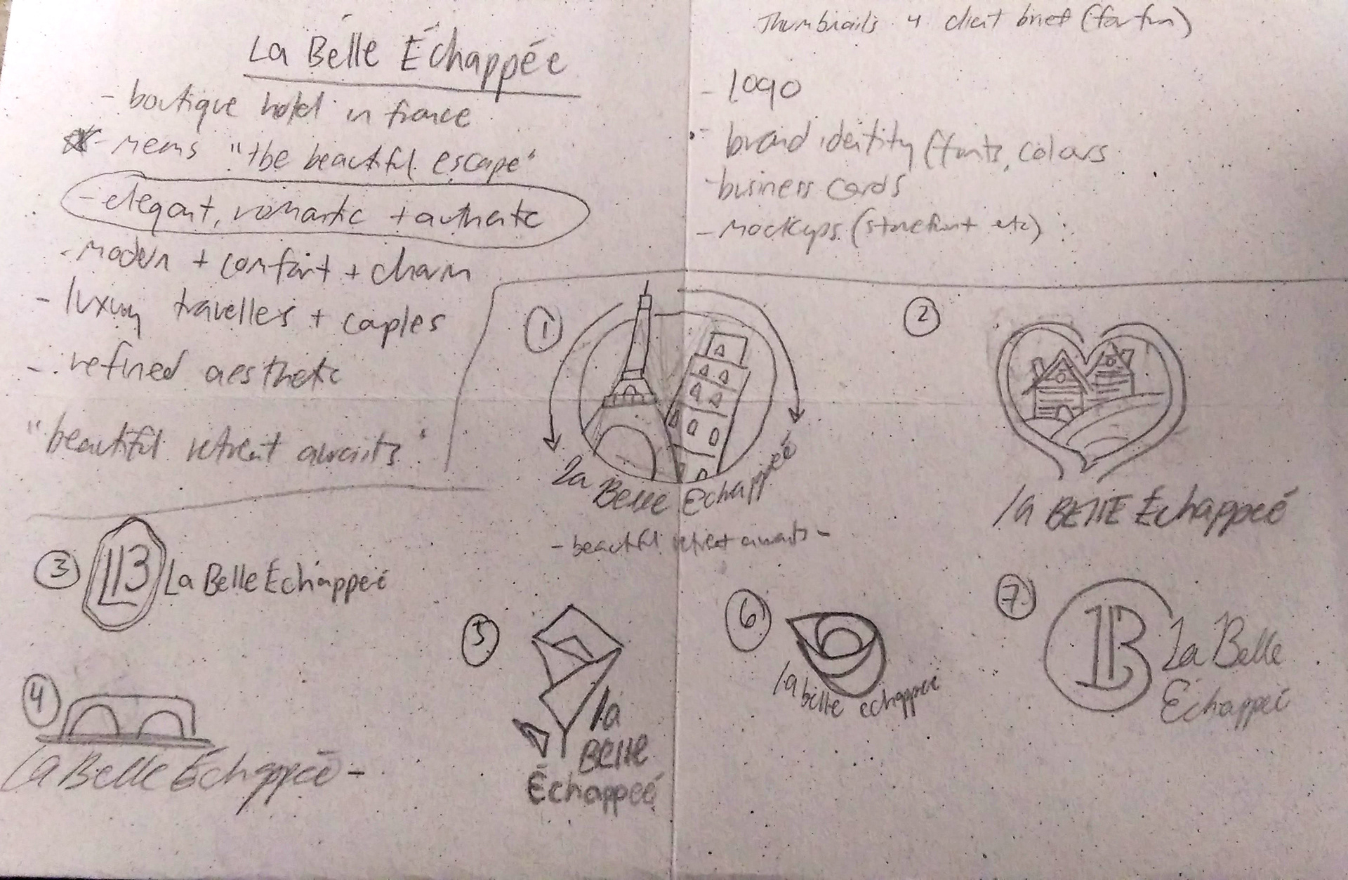

Starting off with my thumbnail sketches, I wrote out some of the keywords and brand standards I wanted to focus on first. I then did research on the French countryside and the general environment to get a feel for what this hotel could look like. Based on said research, I started to design some logos, but they felt a little too complicated. When I look at most hotel logos and branding, I see simple shapes and wordmarks. The focus is not usually on the logo itself but on the entire brand and feel of the company. That led me to my love of number 9, as it encompassed the elegant and romantic aspect that the brand called for. Cursive is a great way to elevate a design, and I knew it would fit well with the hotel.

These were my top four alternative options. I think the bottom rose logo was a close second. I really liked how the font paired with the logo; they fit well together. I am glad I used my final choice because it allows the brand to come first.
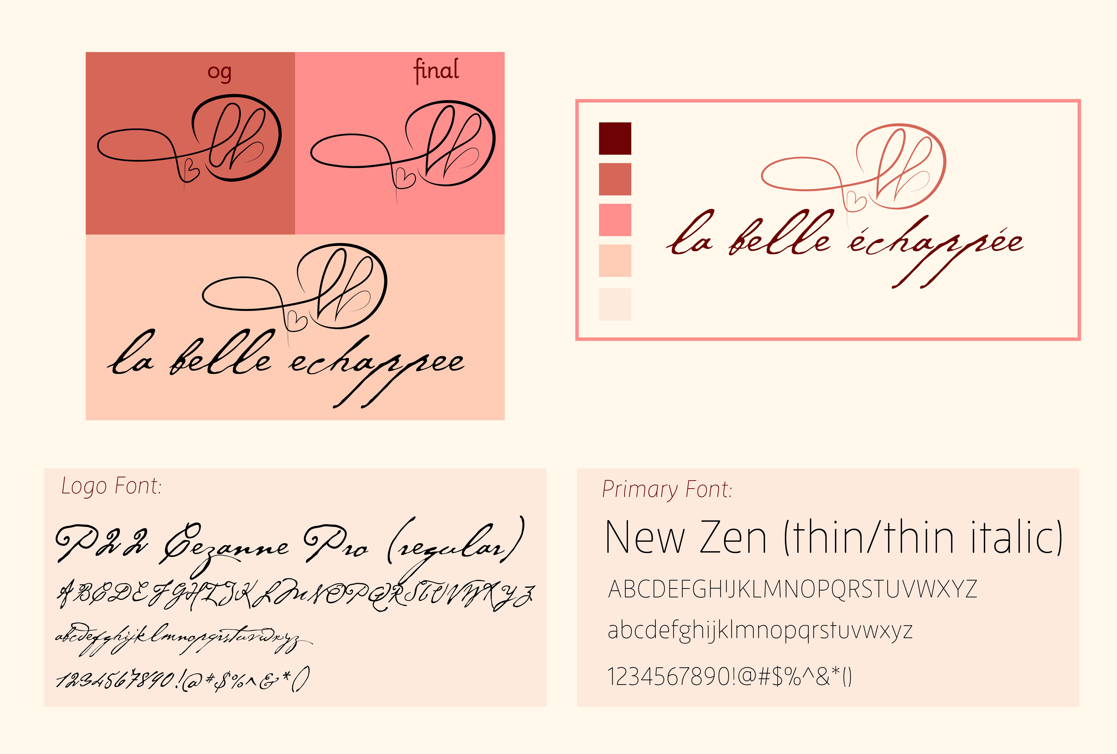
This is a little snippet of my brand book. I made a comparison between the original logo and the final logo. I sharpened out some of the round corners and made the heart a bit bigger. I included a colour scheme, and I went for a more romantic sunset vibe. These are the fonts that I used in the book. I love the logo font; it looks like a mix of old English writing and classic cursive, which I found interesting.
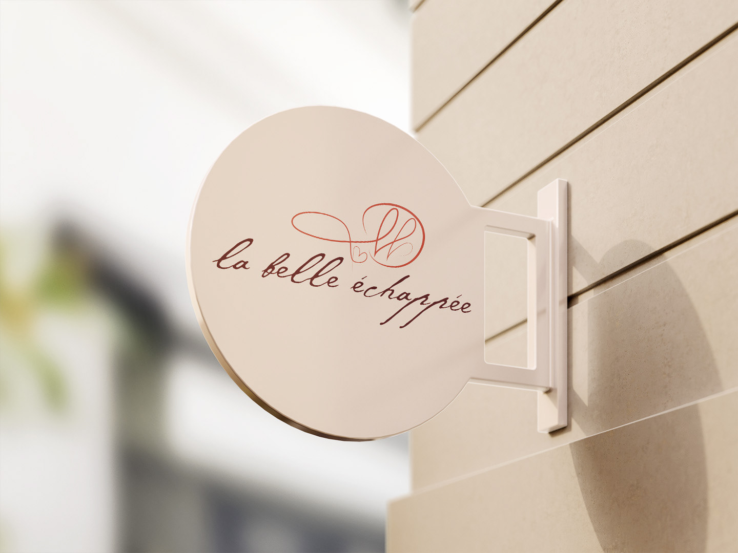
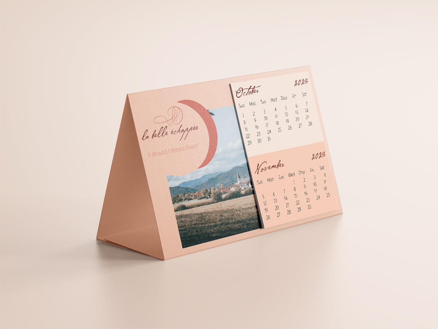

In order to showcase the branding for La Belle Echappee, I created several mock-ups that highlight different assets of a hotel. I love how the calendar turned out; it feels like something you would see on the receptionist's desk. The door sign was an added bonus, since I had to resize my original design so it would fit on the layout.