A design skill I have wanted to update for awhile was my ability to format and layout a book cover. I have found recently that this is a segment of design that I would like to dive into a bit more. I thought a good way to start and practice would be by taking a book cover I am already familiar with and re-designing it to suit a different audience. Designing for print can be tricky, depending on the overall themes and genre, it can be a hit or miss. I decided to take the book "The Outsiders" by S.E Hinton and create a cover that better depicts the main themes of the story. I always felt like the original cover did not quite prepare readers for what they were getting into. My target was creating a more modern, simple and young adult appropriate cover. I ended up creating three variation covers based on my initial sketches and ideas. All the designs were created in Illustrator and then I threw them into InDesign to format and ensure they were in CMYK.
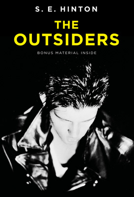

The original cover is shown on the left and my initial sketches on the right. I used the original cover as a guide on what I did not want to replicate. After some research and inspiration, I came up with the four options as seen. Of course as I started refining, I scrapped number four simply because it started to get too complicated. The other three designs fit my objective a lot better.
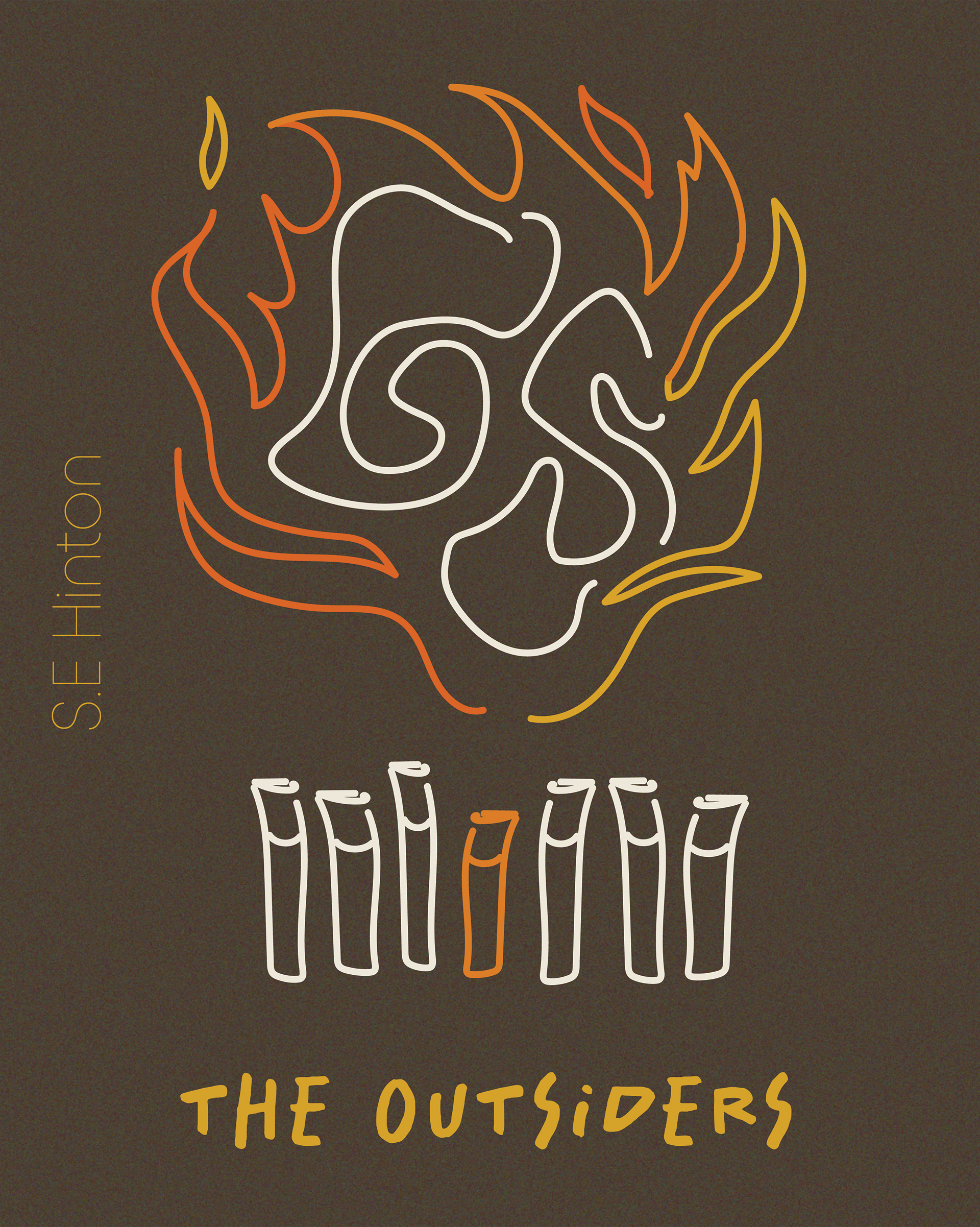
This is the first cover I designed. I wanted to incorporate a more line art style. I have seen several young adult (YA) novels with similar styles and they have always intrigued me to at least look at the inside flap. The general synopsis of the book is that the main character Ponyboy is a part of a gang called the Greasers. Their rivals are the Socs. When a murder takes place on one of the Socs, everything kind of goes up in flames so to speak. I wanted to include some key elements on the cover such as, cigarettes, fire or flames and an indication of each of the gangs. Inside the flames there is a "G" and an "S" to symbolize the general turmoil that becomes of both gangs. The seven cigarettes symbolize the seven Greasers, the orange one being Ponyboy. He is the character that is a bit out of the box for the time, he doesn't particularly think and act the same as his buddies. I added a slight grain effect on the background to tie everything together a bit more.
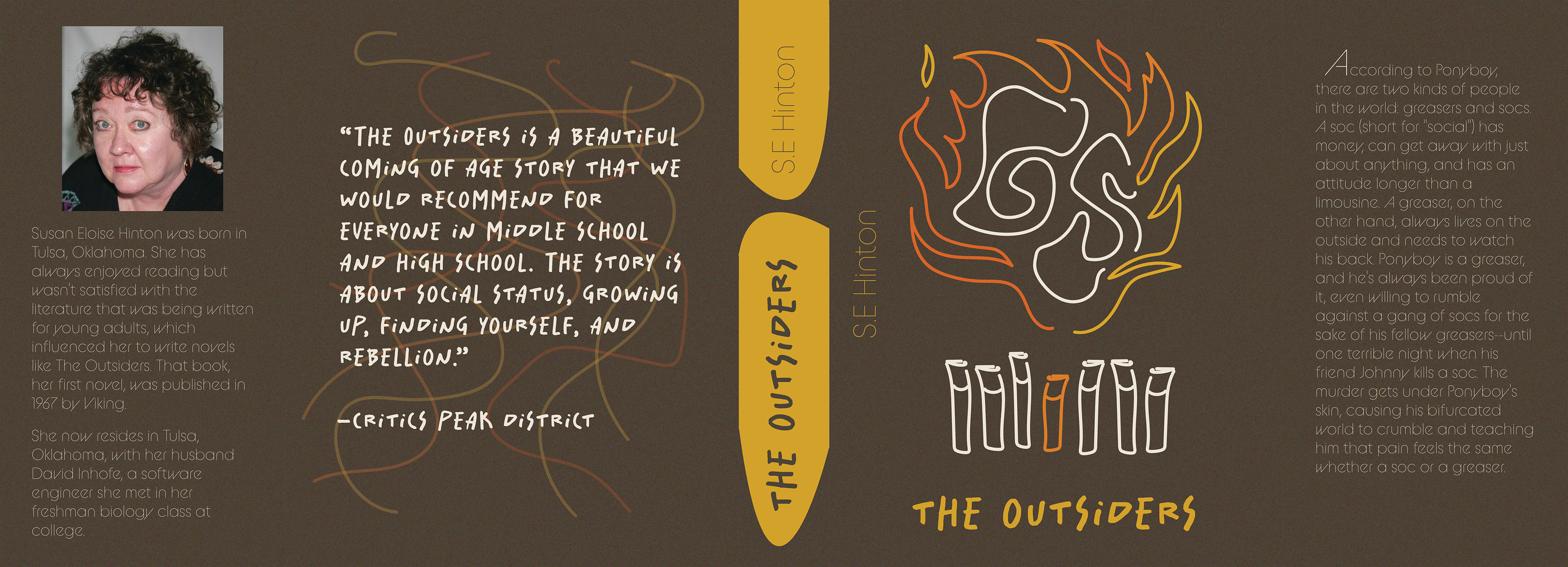
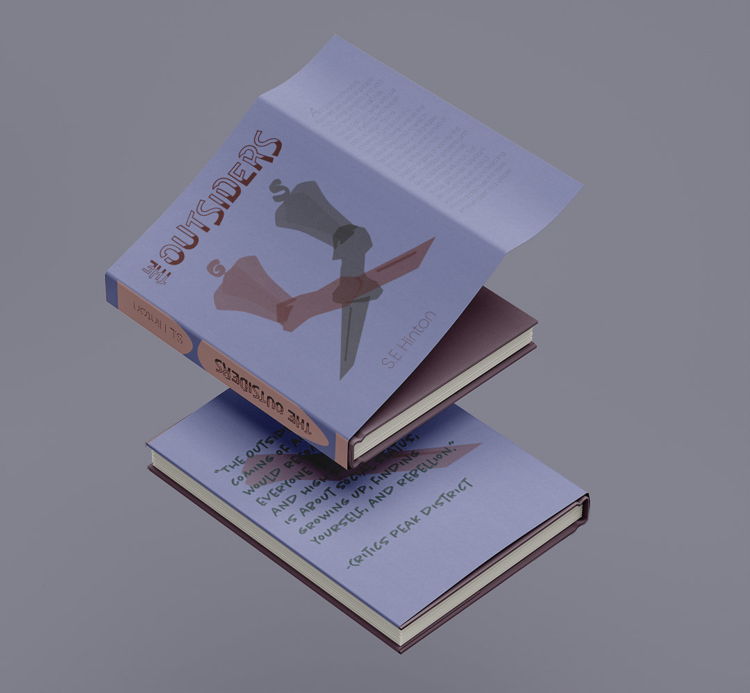
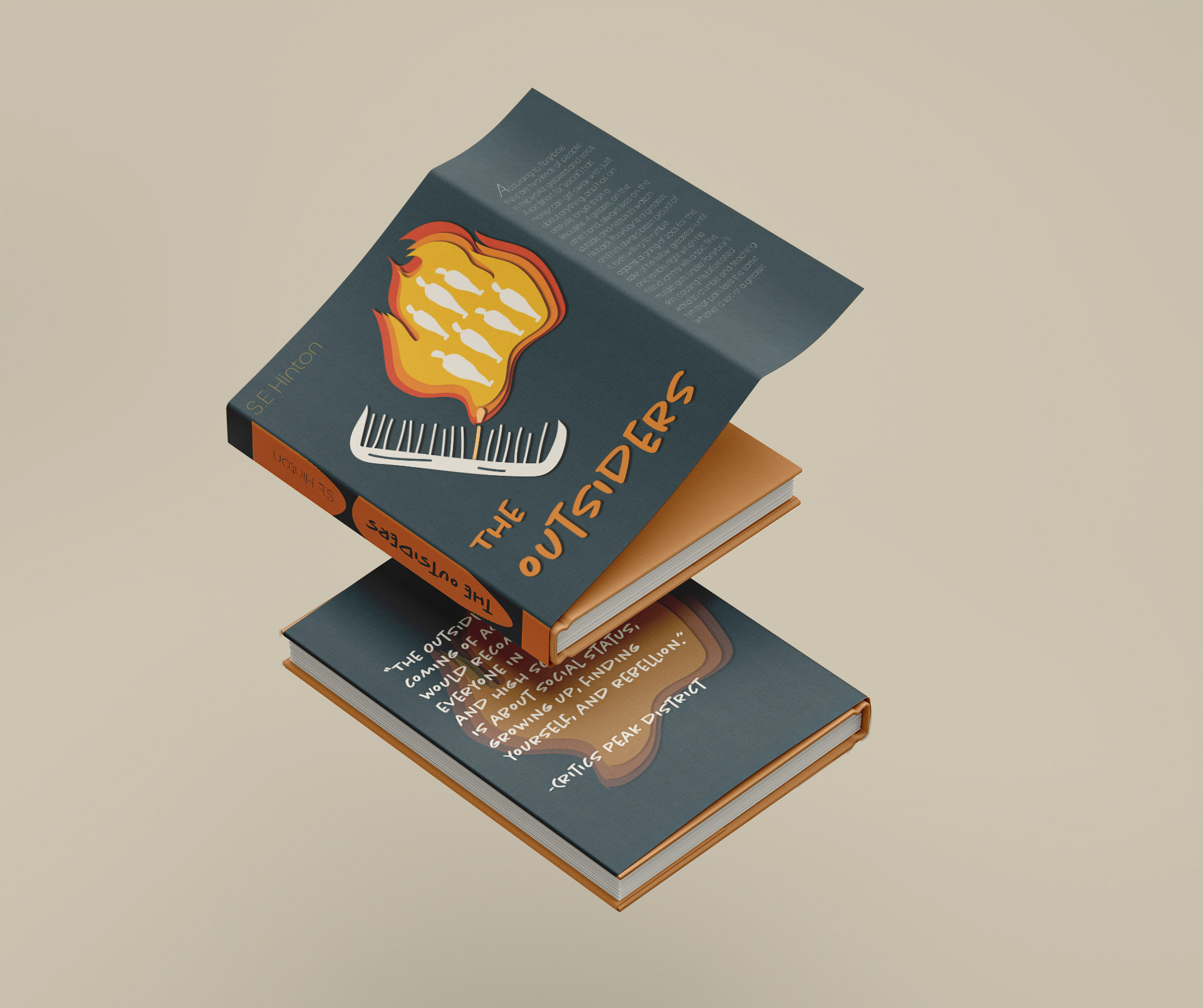
This is the cover fully laid out as one sheet with the authors page, back cover, spine, front cover and inside description. Since that is normally how covers are printed out I started with that format and built onto that with my designs.
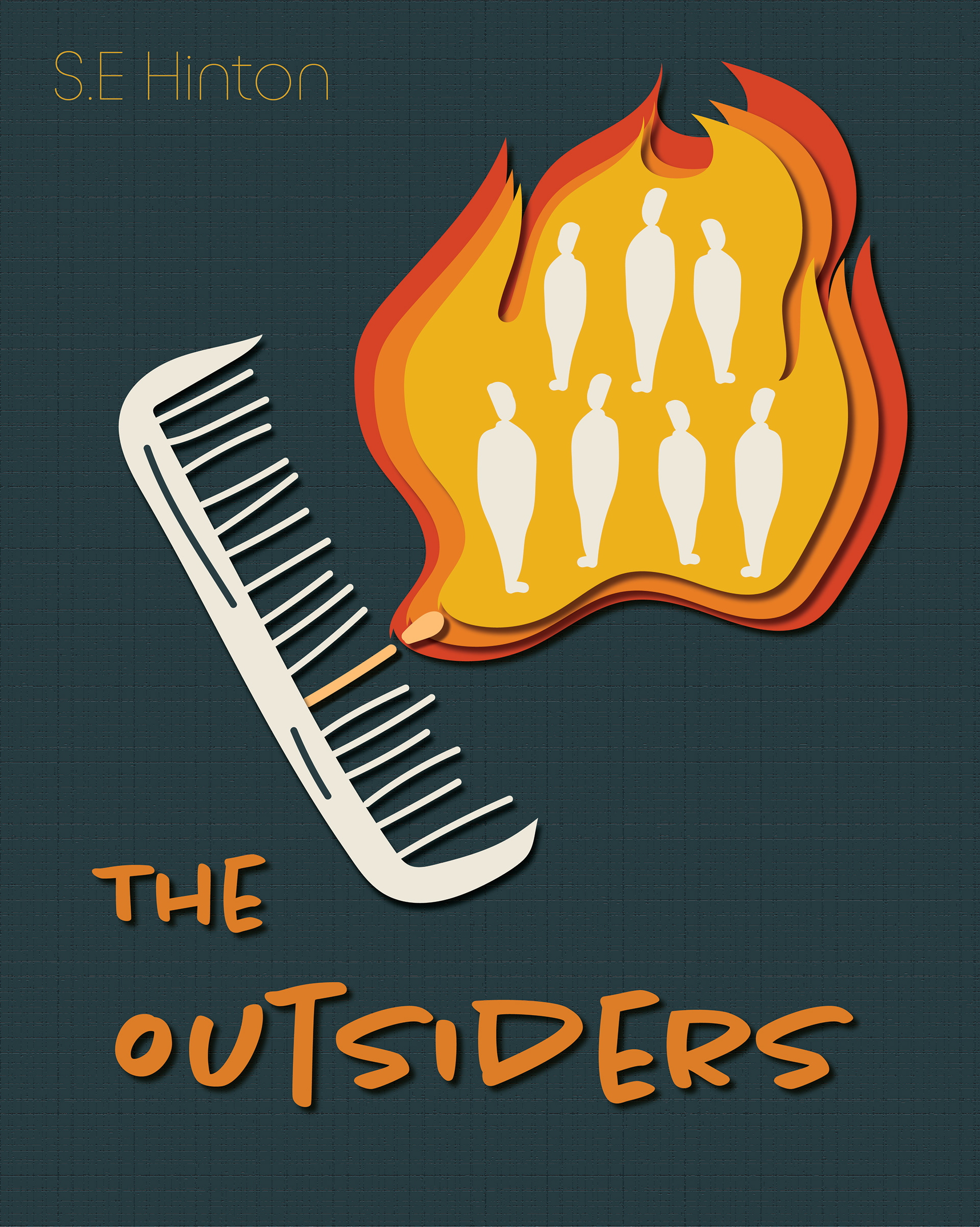
This is the second cover I designed. I would say this one is my favourite out of all of them. I think this one perfectly captures the essence of the book. I went very texture heavy with this one. I love when I see designs that include cutout features, I think it adds such a cool effect. I was able to use the fire element as a base for the cutout effect. In the background I applied a craquelure filter, it sort of looks like stitching or tiles. My use of theme related items was shown through the comb, the seven cutouts in the fire and the matchstick lighting the fire. In the novel at the time, combs and greasy hair were the rage. Considering the gang name of "Greasers" it is certainly fitting. The matchstick being one of the comb picks was sort of symbolic. Sometimes it's easy to break the picks when you are combing through difficult hair, so in contrast it could be easy to "light" the pick on fire based on how greasy the hair is.

I particularly like the back cover for this design. The semi-translucent fire cutouts in the back add to the overall effect.

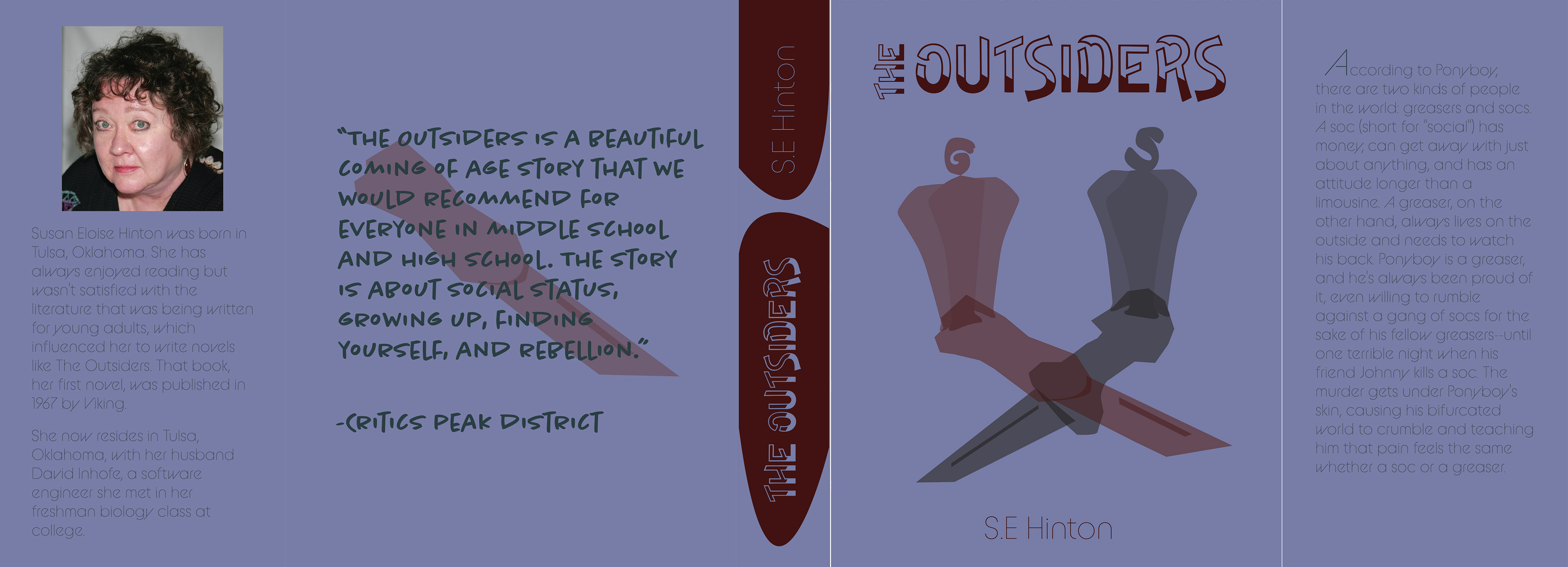
This is the final cover I designed. Between the three, I think this one is probably the darkest, not just from the colour choices but also the fonts and symbols. I loved the font I found for this design, it reminds me of like a cup filling with blood. That definitely touches the darker themes of the novel. I wanted this cover to show the weapons, the switchblades and knives that were most popularly used in gang fights at the time. The silhouetted people are mainly a symbol of the two gangs, the Greasers and the Socs. Something I actually did not realize until I was putting the final design together, is how you can sort of see a face in the overall design. Each person has an eye at the base, the intersection of the weapons forms a nose of sorts. I think that also adds to how the book cover should come across, eerie. Like you can't quite figure out what is going on. Among the three, this one suits the themes and key plot of the book the most.
I appreciated how simple this one turned out. I didn't add any textures or effects because I felt that it would be a bit too much. The focus was meant to be on the cover for this one.